Speaking with fellow college coaches at showcases and ID camps, data analytics is still in its infancy in America’s college soccer scene.
And this is regardless of division. Whether NCAA division 1, 2, 3, NAIA or JuCo, integrating data analysis in performance analytics and opposition analysis is still largely neglected.
The previous analysis in this series, developing styles of play within the NCAA Division 1 level, gave an idea of how to identify playing styles using data. The second article will focus on the pragmatic. This data analysis is effectively a how-to guide for NCAA college soccer programs.
This is certainly not exclusive to American university programs, as professional clubs can take from the processes mentioned in this article and start applying them in their environment, but we’re going to stick with NCAA statistics in this analysis and provide a framework for incorporating data analytics.
The game model, performance analysis and KPIs
Let’s start with performance analytics.
The first thing to acknowledge is that data is not the starting point. Instead, it’s a measure of key performance indicators (KPIs) centred on the game model. That’s where performance analysis begins. To know what to measure, you must have a clear picture of what a good performance looks like.
In terms of linking data with the game model, the direction of it has to move from the playing philosophy to trackable data, so developing the game model comes first.
Are you going to build out and connect the lines? Would that make possession more indirect, or would you like a De Zerbian direct possession style? Perhaps you want to emphasise transitions and create attacking half-recovery situations that lead to Liverpool-esque counterattacks. Maybe it’s in your best interest to get numbers behind the ball, find the target forward and win the 2nd ball.
Develop the game model first. Once you have the general idea or exemplar (Pep’s Manchester City, De Zerbi’s Brighton, Mourinho’s Real Madrid, Claudio Ranieri’s Leicester City, etc.), then you can build out the ideas as you work your way through the various phases of play.
Even within those phases, break them down into sub-phases. What type of structure do you want in the build-out when in possession? What’s the objective? Are you trying to create space in a general sense through ball-near overloads to unbalance the opposition, and then break the press? Maybe you’re targeting a specific player higher up the pitch or targeting entry passes into specific areas of the pitch. Then move to how you want to connect play in the middle third to create final third entries and how you intend to attack the box. I find that more general principles are best when determining the game model, then more specific actions are best when developing tactics specific to your players (and from game to game when relating your game model and tactical execution to the opponent).
Knowing what you want to see will give you specific KPIs to track. For high-pressing teams, attacking half recoveries are significant. Maybe it’s the ratio of counterattacks to positional attacks that you want to track. Perhaps it’s the ratio of total passes to forward passes, PPDA, or touches in the penalty box. For those coaches and analysts who are willing to manually code games, the average number of passes and time of counterattacks will offer insight into the quality of the attacking move. Low numbers may indicate poor shot selection, while the other end of the scale shows the tempo is too slow. To gain clarity in any of these metrics, identify successful events and use them as guides for determining KPIs.
Once the vision of the game is straightforward, establish your KPIs. Once you have your KPIs, coding languages or Tableau allow coaches and analysts to create simple graphics, like pizza charts or timelines, to show overall numbers relative to your conference or season progression. To give an alternative approach, we’ve taken Notre Dame’s 2022 performances and tied the data to the match results. The goal here is to look for anomalies in the data. Since Notre Dame’s record was 8-2-7 (though I removed the 8-0 win over D3 Kalamazoo from the data), it offered a nice spread of results. For teams that consistently win or lose, there are other ways to frame the data to gain insights into good and bad performances.
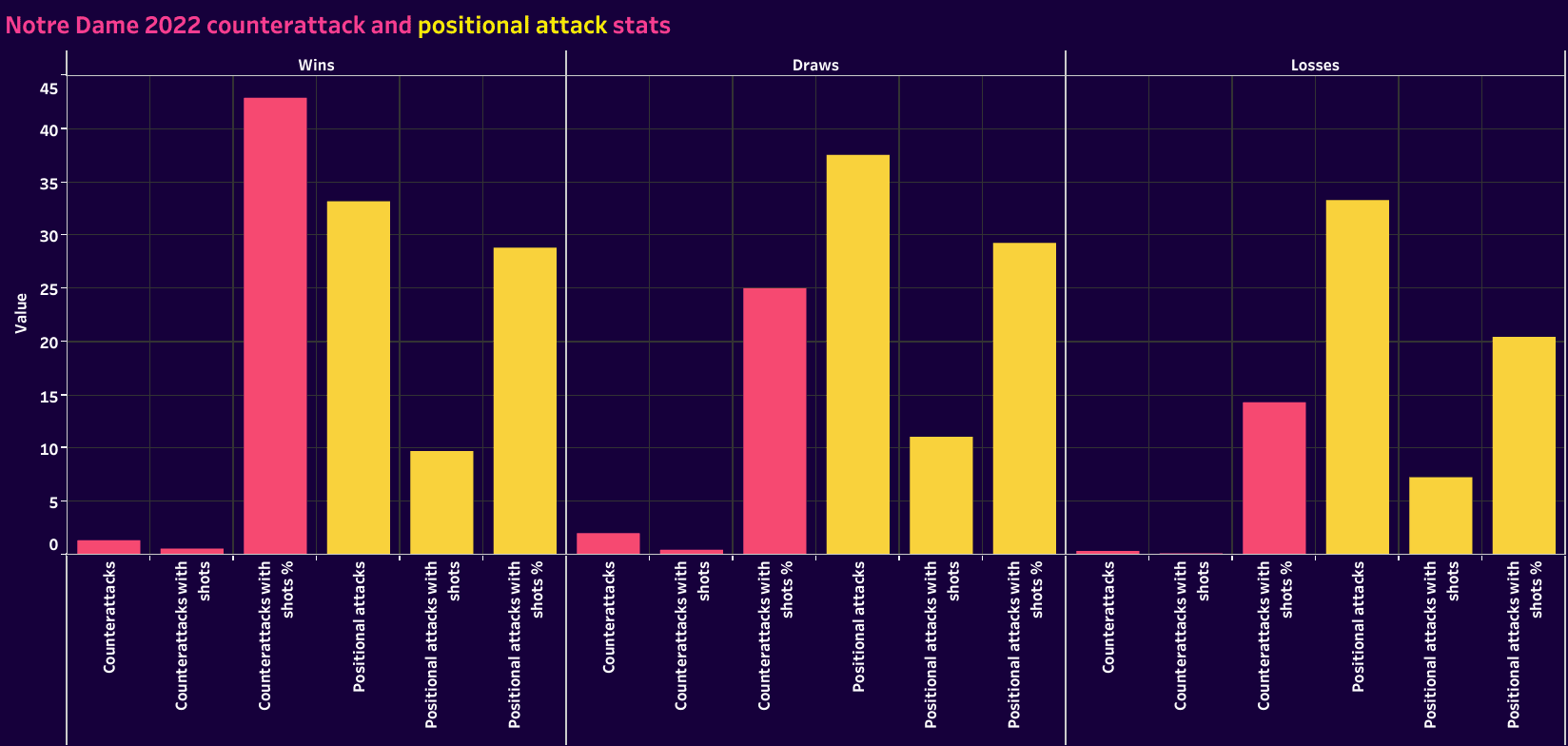
The game changer may be establishing opponent KPIs. The idea is to Red Team (more on this later) your own game. Knowing your game model and KPIs, put yourself in the position of opposing teams and ask, “If I were to coach against my team, how would I approach the game? Which metrics would best correlate to a positive performance?”
Data from previous seasons also indicate the stats in specific categories during good and bad games. This info can be beneficial. First, there’s a baseline for measuring performances.
Second, you’ll gain insight into how opponents approach games against you.
Third, you can take this data and break it into tiers based on the quality of the opponent. Top teams won’t play against you in the same way a bottomfeeder or comparable squad would.
Fourth, you can use these numbers to evaluate your KPIs. Some metrics may need adjustments, addition, or subtraction from the ranks.
Fifth, you will have the objective metrics for your opposition scouting reports. Even here, you can create a general game model viz with essential representation of possession, where they recover the ball, long passes, total passes, through passes, etc. (think how they construct play in attack and how they defend) and a second data viz with the Red Team KPIs to show how they’ll fair against you in those most critical events.
Attack construction should target actions that are key to the team’s success. This will vary based on the coaching staff’s game model. Visualising the numbers with a simple bar graph can be helpful.
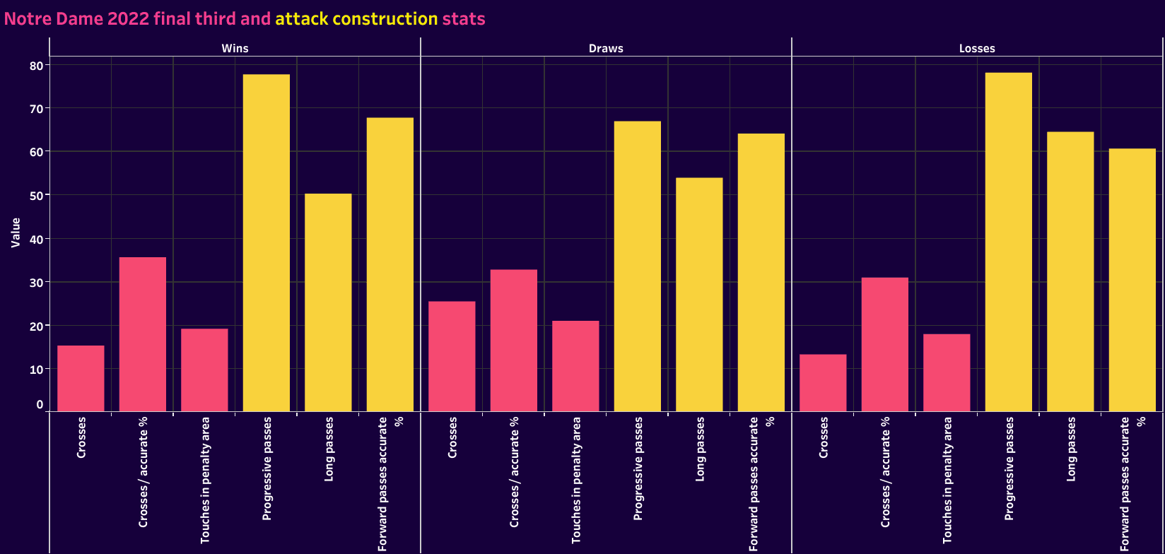
That’s one straightforward way to organise and visualise the data. Creating a timeline visual is another option, or a dashboard highlighting several stats. Even how the team’s stats relate to opponents offers multiple options. Coaches can relate the data to conference opponents or averages for conferences of a similar tier. Relating your team’s KPIs to opponents offers both the baseline markers you want to hit and an indication of success in those categories relative to opponents.
So, to recap, start with subjective ideas of how the game should be played and build the game model. That’s step one. This is pure tactical theory based on principles of play. Once that’s established, add the next layer, which is the qualities of your players, and then add the relation to the opposition.
That’s the heavy lifting. There are no shortcuts or hacks here. Take time. It’s worth it.
Once those ideas are developed, and the game model is clear, the KPIs will come to you very naturally. From there, visualise the performances of the staff and players so that everyone is aware of the most important actions to secure results. If visualisations aren’t your forte, create a spreadsheet with your KPIs. Present that data to the team.
Also, note that data is in addition to the video segments of the scouting report, not a replacement. Players benefit from seeing specific patterns a few times and seeing how the opposition uses key players in each phase.
Incorporating data in opposition analysis
Performance analytics relates to the game model, applying specific metrics to give an idea of your team’s performance. Using statistics and opposition analysis can produce a similar effect. For Division 1 programs with reliable data sources, such as Wyscout, it is certainly possible to build a framework to analyse an upcoming opponent’s style of play.
In the last article, we took non-conference data and spent a few hours cleaning it to create data visualisations. Let’s face it; we simply don’t have the time to clean data after each round of games. Rather than spending the time and effort to expand the analysis to include individual metrics for each NCAA Division 1 team in the nation, we can instead take national and conference averages to get a sense of how upcoming opponents relate to other programs. Within conference play, it may also be valuable to spend 30 minutes to an hour gathering and cleaning data to present a statistics-driven data analysis of the opposition.
Why take the time to incorporate data? It’s because data gives you an objective measure of the opponent’s performances. There are no narratives, no agendas and no bias. Data doesn’t give you the whole story but is a great starting point in an opposition analysis. Think of it as another way of telling the story of how an opponent plays. Starting with data and then progressing to video analysis, we get a more complete picture of how the opposition like to play.
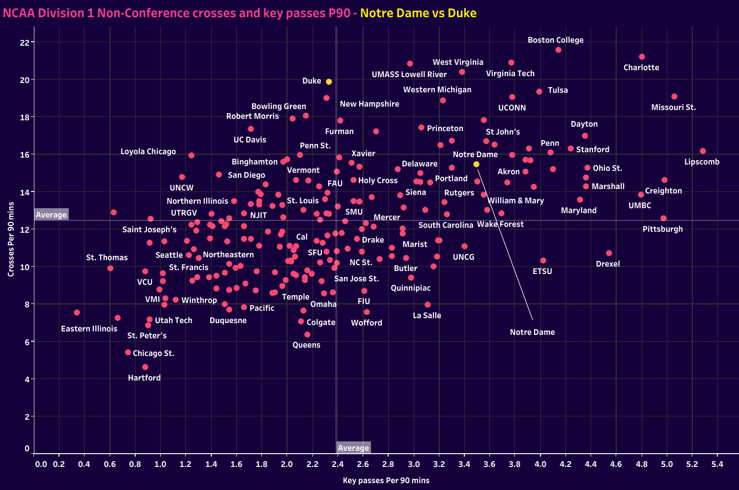
We won’t go into full detail here, but take a scenario where Notre Dame is preparing for a conference game against Duke. Highlighting the key strengths and weaknesses of the two teams involved gives critical information as to how the match will play out. Notre could look at the scatter plot below and see they have a nice blend of crosses and key passes, whereas Duke is likely to send a barrage of crosses in the match.
Additional context is necessary, such as understanding whether or not Duke routinely faces low blocks and their success in pulling teams higher up the pitch. That’s where video comes in. That said, the data alerts us to a potential problem we must solve.

Defensively, we can look at the two team’s PPDA to gauge the intensity of the counterpress. Additionally, we can use high and medium recoveries to develop our understanding of the opponent’s defensive tendencies. Video will give us an idea of where Duke likes to set their press, but supplementing with data will indicate their success defending in that part of the pitch.
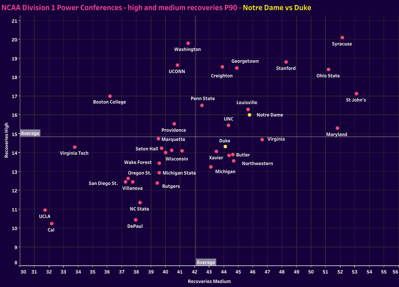
Whereas performance analysis is designed to track performance metrics that are relative to the KPIs determined by the game model, the use of data in opposition analysis should paint a picture of how the opponent plays the game. It should offer insights into their game model. Essentially, data tells their story, but in a different manner than video scouting. When those two methods are used harmoniously, the attention to detail and awareness of positive and negative actions skyrockets within the squad.
Granted, not everyone has this kind of data available. I have to manually code matches at D3. Data platforms simply don’t offer the resources I need. Our program uses VEO’s coding options, FC Python and NAC Sport, to code matches, track KPIs, and analyse the opposition. This is your best option for incorporating data for the D2 and D3 coaches reading this article.
Red Teaming the insights
Bryce G. Hoffman’s book, “Red Teaming: How Your Business Can Conquer the Competition by Challenging Everything,” is a fantastic read for college and professional coaches. He details how military personnel and businesspeople use a concept called red teaming to build out an idea of the strengths and weaknesses of all the teams or players involved in some form of engagement where a winner and loser will be determined.
Analysing performance in opposition data gives a glimpse of each team’s strengths and weaknesses. Combine that with video analysis, and you answer key questions in each phase, discovering the who, why, where, when and how of a team’s play.
Red teaming is the process of analysing a tactical matchup from both teams’ perspectives. Split the coaching staff between our team and the opposition, then engage in a theoretical duel to gauge how the matchup will play out. It’s essential for the coach playing the role of the opposition’s manager to understand their game model and specific tactical tendencies, especially against opponents with similar playing styles and quality to your team.
Looking at the chart below, if I was preparing for a game against Butler, I might argue that we should keep numbers behind the ball and give them shots from distance. Knowing that they have a tendency to shoot from distance, we could design our match tactics to encourage them to take shots from 25-30 m.
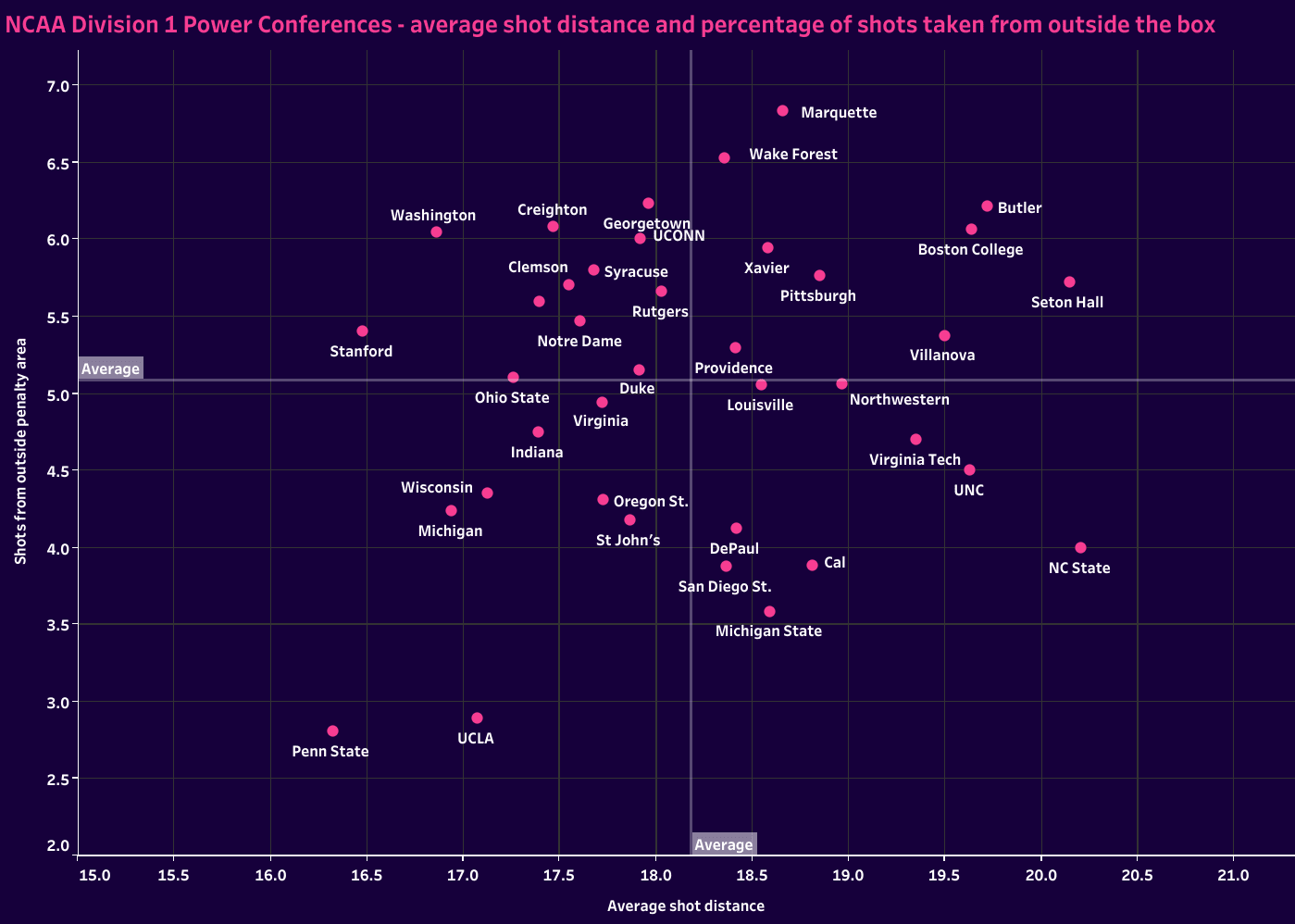
Sticking with the theme, If I’m coaching Notre Dame and we’re preparing for that match against Butler, this chart gives me an idea of the shot quality the opposition is willing to settle for and offers some feedback as to our performances. Hovering close to the average likely means that we’re keeping opponents somewhat off balance and demanding that they respect our shot from distance but also know that we are searching for opportunities closer to goal.
As the coach, I could then correlate the data in this visualisation to Butler’s defensive tendencies, especially understanding whether they consistently get numbers behind the ball in their defensive third and, if so, how we can approach that obstacle.
Low and medium losses are another significant category to add to a red teaming session. While recovery locations give a sense of an opponent’s ability to win the ball in each third of the pitch, low and medium losses offer a sense of how press-resistant teams are. When we press them high up the pitch, how likely are they to give the ball to us or to simply put it out of play, resulting in a turnover?
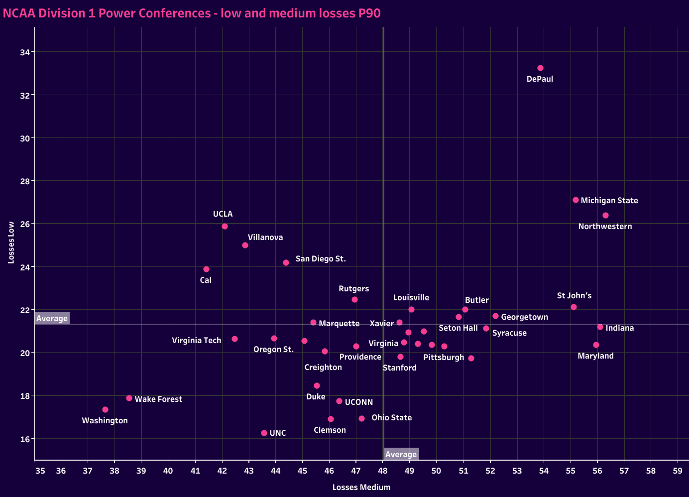
I can also use this information to gauge which teams are willing to take on risk at the back and have the courage to build out versus those risk-averse who want to play the odds by smashing balls up the pitch.
Finally, let’s not forget set pieces. Winning the set piece table plays a significant role in a team’s final position in the standings at the end of the season. Wyscout offers data on set pieces as well, so we can gauge how many corners a team receives in a typical game in the likelihood of their set-piece sending in a shot. If my team is playing against Providence, Pittsburgh or Michigan, we want to do everything we can to avoid giving them corner kicks.

That information changes how we defend in the defensive third. We may want to limit their time in our third of the pitch or step more aggressively as they enter shooting range to limit the number of deflected shots that go out of bounds.
Red teaming is the last step for effectively incorporating data. In doing so, we’re using all the tools to gauge the opponent’s strengths and weaknesses and how they relate to us. Using those insights, we can better design our approach for that specific matchup, making tactical tweaks based on the opposition while remaining true to our game model.
Conclusion
Performance analysis, opposition analysis and red teaming are three ways NCAA Division 1 programs can implement data in their programs. Few college teams incorporate data beyond the typical ESPN box score-type statistics, like possession and shots taken.
Soccer is still in the data revolution’s early stages, but so much more can offer NCAA Division 1 programs. For the coaches willing to step into the forefront and design a performance and opposition analysis process, this is an opportunity to jump ahead of the game and take advantage of the slow adapters.



Comments