Over the course of the last week, I have noticed some familiar discourse on social media around the use of data visualisations and football. Before I go into the nature of this narrative I should probably point out that I don’t support one point of view over another but I do understand both.
There were some people posting that they were disillusioned with the sheer number of people on Twitter who were sharing scatter graphs with little or no context or insight. These are relatively easy to create and to throw up online and they can, at times, get good traction and interaction.
The problem comes when these scatter graphs are put up without any context or any attempt to gain insights from what the data is telling you. Data alone is rarely enough for you to gain insight into a player, a club or a league. You have to be able to either find the right combination of metrics to show what you are trying to prove or use a combination of formatting and text to try to add to the story.
At the same time, I understand why people would try to put these data visualisations up in order to start to get noticed and even to practice. I have done the same things when starting to use data in connection to football and there is nothing wrong with this, just try to think about what you are trying to say or get across and who you are trying to get the message across to!
Interestingly, these conversations were taking place on social media around the same time that I was having more focused work-related conversations, which I can’t go into for obvious reasons, about how we can use data more effectively to give us the insights into data and to start to drill down into the kind of players who should be of interest to us as part of the recruitment process.
Data is an important part of the recruitment process but we have to remember that it is just part. There is little value as a recruitment analyst in inundating people with numbers, data or even visualisations if they are not relevant to the players or markets that you are looking to recruit from.
Recently I have started to see the value in finding ways to visualise a players output in direct relation to their team. Let’s look at an example.

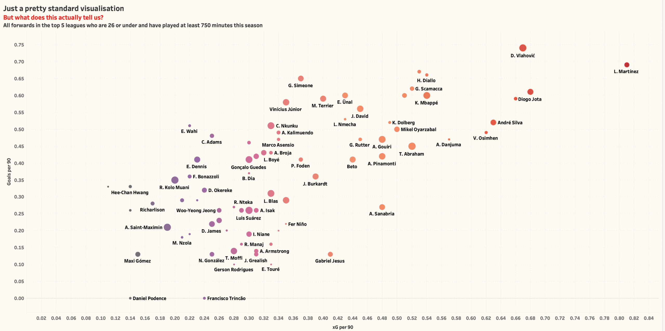
Here’s a scatter graph that doesn’t actually give us a lot of insight. The data set is all forwards in the top-5 European league that are 26 or under and that have played at least 750 minutes this season. The graph shows goals per 90 on the. vertical axis and xG per 90 on the horizontal axis and it largely tells us what we would expect it to. The likes of Lautaro Martinez, Diogo Jota, Dusan Vlahovic and Kylian Mbappe are very good forwards. Great, but what else? Not much, right?
Yes, we can drill down further towards the middle of the graph to look to see whether there are any interesting names there but in truth in visualisations like this will draw peoples eyes to the top-right area of the graph to see who the standout players are. But that doesn’t mean that the metrics that have been used in this visualisation do not have merit when we are looking to assess forward players.
It was at this point that I realised that we can use these same data points but flip to focus to examine the extent to which these players contribute in these areas to their team. It’s normal after all for the best players to find themselves in the top-right of a scatter graph but it is also normal for the players who play for the most dominant teams to appear here. If our data set was Austria specific for example you would expect to see a lot of RB Salzburg players in the top-right. Does that mean that players at the likes of Wolfsberg or Austria Wien are less relevant to your recruitment process? No. So, how can we use the data to show how important players are to their teams. Well, like this.

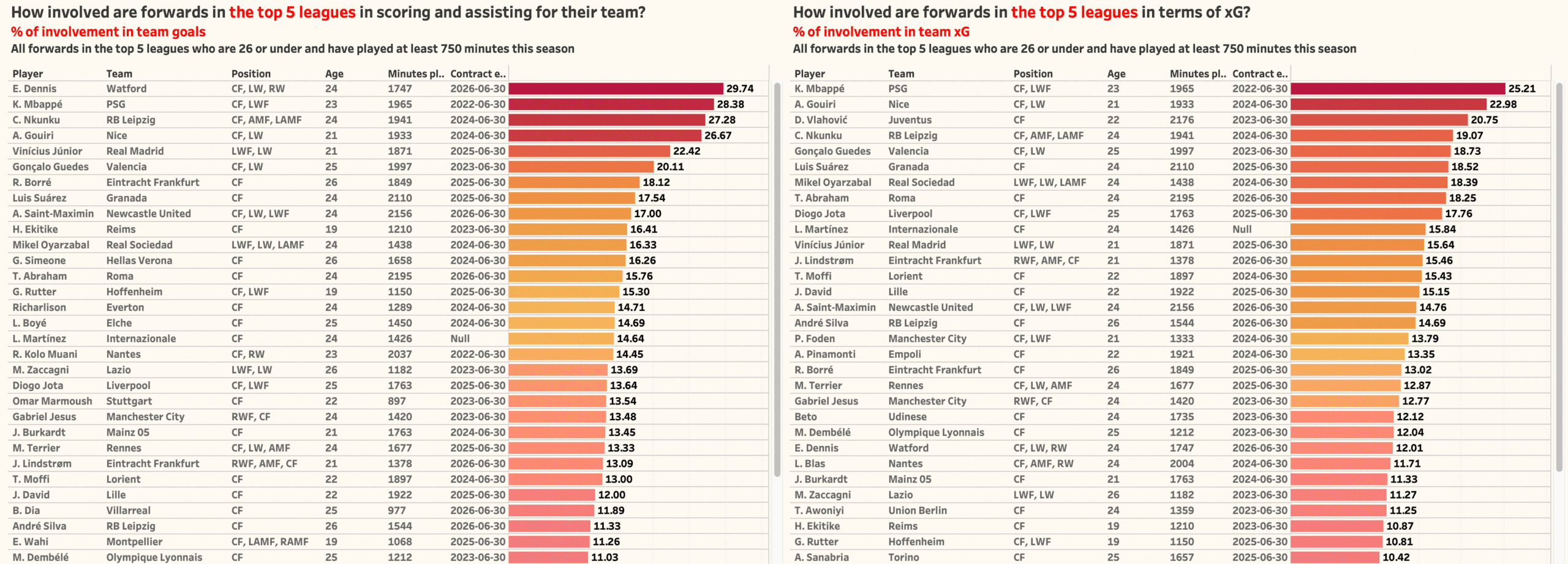
So, by using simple models and calculations to give us the % involvement that players have in their teams total goals and xG we start to see some different names pop out in the data. To be clear involvement takes into account goals and assists or xG and xA for the players so that we are not only looking at goals scored on the player level.
By using the data in this way we start to drill down and understand which players are the most effective for their teams. This allows us to identify players who are perhaps playing for teams who are not performing well enough to see them at the top of the table.
Let’s take a couple of quick examples to illustrate the point. Top of the ranking of % of involvement in team goals is the Watford forward Emmanuel Dennis. At the time of writing, Watford are sitting 19th in the Premier League but we can see that Dennis has been involved in 29.74% of their total goals in the league this season. Another example is further down the list where we can see that Randal Kolo Muani of Nantes has been involved in 14.45% of their total goals in Ligue 1 (he is also out of contract this year) while Nantes are sitting 9th in Ligue 1. Using this method we start to gain an insight into other players that we can target as part of the recruitment process.
Importantly, this process also passes the eye test and we can see that the likes of Mbappe and Vlahovic still feature and for Newcastle fans can you see why Hugo Ekitike was a target in January?
Let’s look at another example.

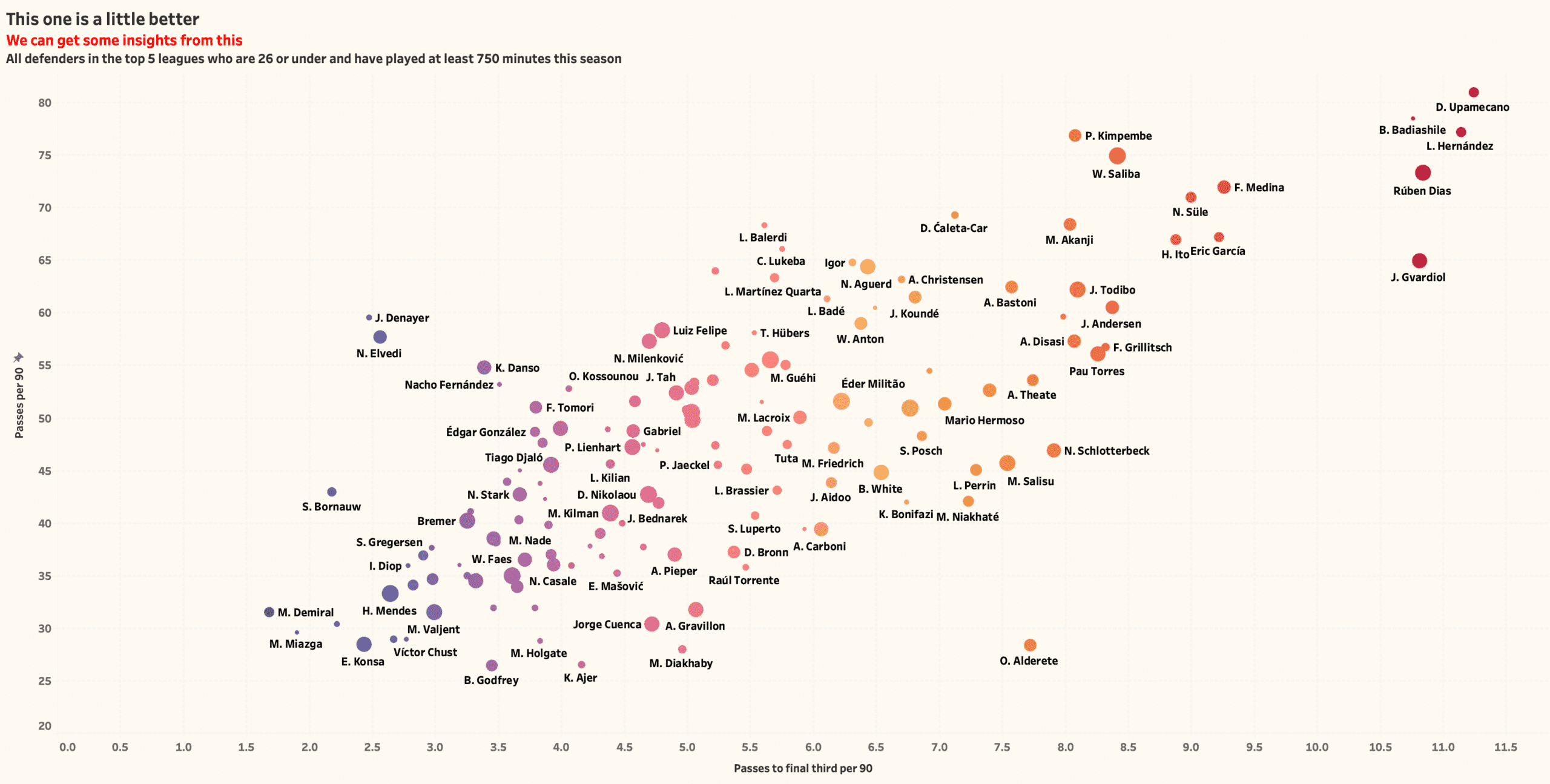
Another scatter graph although for me this one is a little better with some more direct insight as this time we look at which central defenders are most likely to progress their team into the final third. This time our data set is central defenders in the top-5 league that are at most 26-years-old and that have played at least 750 league minutes. The vertical axis is passes per 90 and the horizontal is passes to the final third per 90. The size of the marks relates to the number of minutes played.
Once again the visualisation tells us what we would expect. Players to the far right, Dayot Upamecano, Ruben Dias, Josip Gvardiol, all play for teams who we would expect to provide volume in terms of playing the ball aggressively into the final third of the pitch. Once again though we can separate these metrics and see how they apply on an individual club basis.

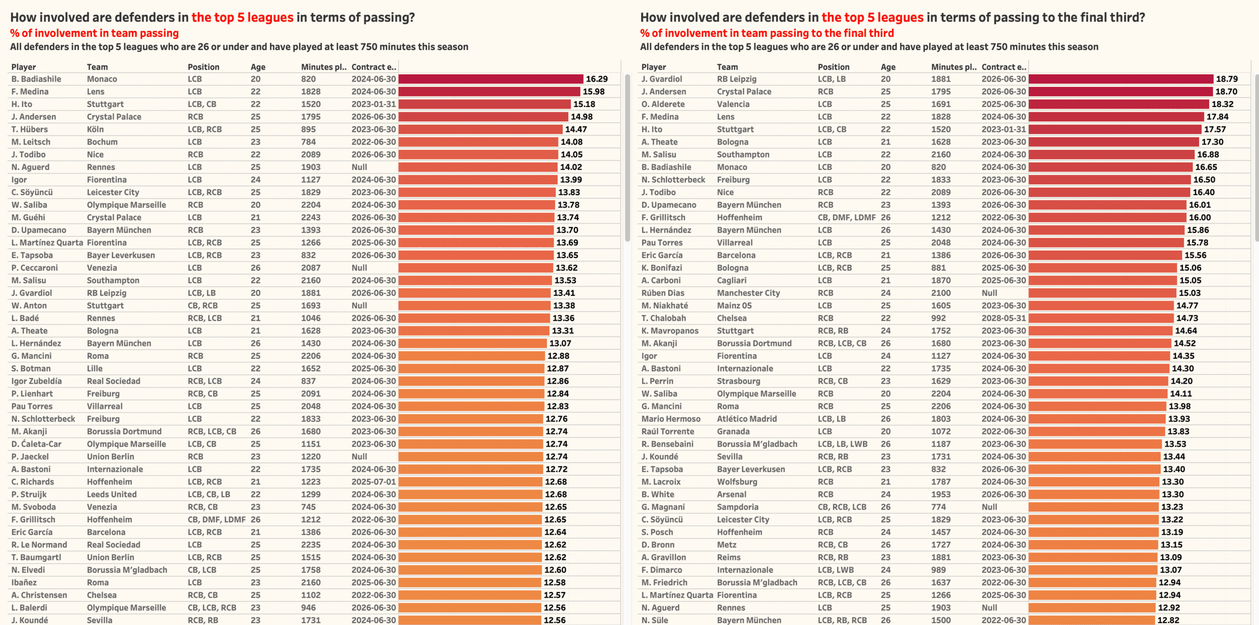
So, the right side of the visualisation shows us the % involvement of each player in terms of passes and the left side shows the % involvement in terms of passes into the final third.
Immediately there are some interesting names standing out with Joachin Andersen of Crystal Palace being responsible for 18.7% of all passes from them into the final third. Palace are 13th in the Premier League and are not known as a side that pass the ball progressively through the thirds. Hiroki Ito is a 22-year-old Japanese central defender who is responsible for 17.57% of Stuttgart’s passes into the final third with the German side sitting 17th in the Bundesliga and Artur Theate is a 21-year-old Belgian defender who is responsible for 17.3% of all of Bologna’s passes into the final third as they sit 13th in Serie A this season, Theate was signed from KV Oostende in Belgium just last season.
Conclusion
Let’s leave it there. This is a theory that can be applied to almost any part of the game that we can measure and the insights that it can give you can become a valuable part of the recruitment process although in order to get the maximum ‘bang for your buck’ from this method you really need to have a clear idea of the metrics that are most applicable to the profile of player that you are looking for.
I want to finish though with a quick message to any of you who have posted scatter graphs or who are thinking about posting scatter graphs on social media for interactions. Don’t be put off by some negativity. Yes, try to think about context and how you can add to the story of your data but everyone needs to start somewhere and practicing and getting feedback is an important part of the process. Plus, you never know who is watching.


Comments