The use of data is not new to the field of sports.
Originating from the American sports of baseball, “Sabermetrics” slowly spread to the other sports in the mainland – football, basketball, and hockey.
While soccer was a little wary of embracing the change so easily, it can’t be denied that analytics has finally permeated the traditional sport as well.
As competition grows, teams are looking for the competitive advantage that they can gain over others – especially with the globalisation of the sport and the advent of new minds and ideas to the game.
Today, the amount of data being collected is huge and almost every top division team has a dedicated team who are tasked with making sense of this data in a manner which helps the team.
As the application of data analytics has increased, so has the supply of the requisite data.
With companies such as Statsbomb providing event-level data for free to encourage greater participation, the casual viewer is privy to the same data that the scientists working in the top clubs of Europe are.
However, data doesn’t speak on its own and the way humans are wired we naturally prefer to look at a picture rather than a spreadsheet full of numbers.
Data visualisation is an art and one you can learn very easily.
Keeping that in mind, in this data analysis piece, we’re going to use the Statsbomb data and create a very simple and popular visualisation known as passing sonar.
What is a passing sonar?
Passing sonars are the brainchild of Eliot McKinley, from americansocceranalysis.com.
It is essentially a bar graph on a polar axis and it can be used to give a very good idea of a particular player’s passing.
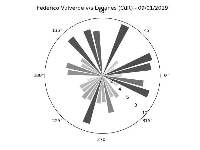
As can be seen above, it has a few different features – namely, the bars, the angles, and colours.
Normally, the bar length indicates the average length of the pass, the angle denotes the angle of said pass.
The colour is another attribute which can be tweaked to give us information about a third attribute – maybe the total passing success rate in that group.
The sonars itself can be created for a particular player from a particular match, for a bunch of matches, or for an entire team!
How to create one?
Now we come to the meat of the matter.
How do we create one? While Eliot himself has a guide on recreating his in R, I haven’t seen anyone any publicly available code to do so in Python.
However, it is very much possible and we’ll go ahead and do just that.
Note: If you wish to only see the code and skip the run-down, feel free to scroll down to the end to my GitHub repository.
If you’re a beginner, I’d strongly suggest going through the entire piece.
Pre-requisites
I’ll be using Python 3.7 to create this (even though Python 3.8 is now available).
I also have the additional libraries of Numpy, Matplotlib, and Pandas installed.
If you don’t have Python installed, the official site gives a decent guide to going about and getting yours up and running.
If you don’t have any of the libraries, you can either use pip to download them or if you’re using Anaconda, all of those come pre-installed.
If all this is new to you, the official documentation is pretty helpful on all of the above and any issues you might face.
Apart from that, there’s a huge community online for all of the above to help you get started.
You’ll also need to have the Statsbomb data either downloaded locally on your computer or cloned on your GitHub account.
It’s strongly recommended to create a GitHub account – if you haven’t already.
Statsbomb are releasing data every day for the previous day’s match so having Git installed makes it all the easier to stay up to date with the files as they’re uploaded.
Again, the online community is very welcoming and newbie-friendly so any queries you might have, chances are they’ve already been answered.
Let’s get started
The first step, as always, is to import the necessary libraries (after creating a new file).
import json import pandas as pd from pandas.io.json import json_normalize import matplotlib.pyplot as plt import numpy as np from mpl_toolkits.axes_grid1.inset_locator import inset_axes from matplotlib.projections import get_projection_class from matplotlib.patches import Arc
We imported json, Pandas, Matplotlib, and Numpy.
Python supports json natively so there was no need to install it.
We’ll need that to work with the Statsbomb data.
Pandas is Python’s version of Excel; it allows us to easily work with tabular data – rows and columns.
Numpy is a mathematical library; we’ll just need it once.
Matplotlib is Python’s most popular visualisation library – we’ll use it to create the sonars.
with open (r"C://Users/ADMIN/Desktop/Abhishek/open-data/data/events/22921.json", "r") as f: obj = json.load(f) df = json_normalize(obj)
We now entered the path to where the JSON file is saved on our computer (the match we’re looking at is France vs South Korea from 08/06/19).
We then load it into a variable called obj.
Pandas provides a very easy way to flatten JSON objects into data frames with a function called json_normalize and that’s exactly what we did.
Now let’s go ahead and look at the Pandas data frame.
df.head(5) #shows us the first five rows
It gives us a look at all the data within the JSON file – all the event data, the freeze frames from the shots, the line-ups – they’re all in there.
Doing `df.shape` tells us the size of the data frame which is 2660 rows and 110 columns.
With all the other data, is the data that we’ll need to create the sonar – namely, the pass angles, pass lengths, and the player’s name.
We’ll also need the players’ names for the entire team and we’ll work on extracting that out now.
Firstly let’s get to the names of all the players from the team.
player_dict = {} klist = [] for player in df.iloc[0,103]: p = player["player"] name = p["name"] klist.append(name) xlist = [0,42,42,42,42,62,62,85,85,97,97] ylist = [45,15,30,55,75,30,60,30,55,22,68] for x,y,z in zip(xlist, ylist, klist): entry = {z:[x,y]} player_dict.update(entry)
The first two rows of the data frame are the starting line-ups for both teams.
We used a “for loop” to parse through the cell containing the data [0,103] i.e.
row 1 and column 104 (Python uses a zero-based index).
We’ll be focusing on France, who used a 4-2-2-2 formation according to Statsbomb.
We then extracted the names from the cell and created a new dictionary – “player_dict“, out of the names with the x and y coordinates.
The x and y coordinates were chosen according to a pitch of the dimensions 130 x 90.
We’ll use this later to plot the sonars on a pitch and to loop through all the players as well.
Here’s what our player_dict looks like now –
{'Sarah Bouhaddi': [0, 45], 'Marion Torrent': [42, 15], 'Griedge Mbock Bathy Nka': [42, 30], 'Wendie Renard': [42, 55], 'Amel Majri': [42, 75], 'Amandine Henry': [62, 30], 'Elise Bussaglia': [62, 60], 'Delphine Cascarino': [85, 30], 'EugГ©nie Le Sommer': [85, 55], 'Kadidiatou Diani': [97, 22], 'GaГ«tane Thiney': [97, 68]}
Cleaning the data frame to extract the angles and lengths
You might have noticed that there are 110 columns but not all of them are relevant to us.
In fact, we only need three, as I mentioned before – the length, the angle of the pass, and the player who did the passing.
So let’s go ahead and clean the table a bit to get only the stuff we need.
Statsbomb has x and y coordinates for the beginning as well as the ending location of the passes in the frame.
Luckily for us, they have also already calculated the angles and lengths and added it to two separate columns.
If they hadn’t, we’d have had to measure those ourselves.
However, we can’t just plot the angles and lengths on their own as that results in not-so-appeasing visualisations and hence we’ll need to bin the data according to the angles and then for every bin, we’ll calculate the average pass length in that direction.
For instance, if a player made one pass of length 10 metres in the angle of 0 degrees, another of 5 metres in 2 degrees, and another pass of 12 metres length in the angle of 3.5 degree, we’ll calculate the average of all the lengths and then plot a single bar to represent all three passes in the middle angle of that bin.
What these bins are? I’ve decided to take a bin of 18 degrees each.
So that’s a total of 20 bins (18*20 = 360 degrees).
Note: The angles in question are in relation to the opponent’s goal.
For more information, check out the documentation of Statsbomb here.
Keeping in mind all that, let’s write a function to take a player name and return the player’s angles as well as lengths of passes in all 20 bins.
def Passer(player): local_df = df.copy(deep=True) local_df = local_df[local_df["type.name"]=="Pass"] local_df = local_df[local_df["player.name"]==player] local_df = local_df.dropna(axis=1, how="all") df1 = local_df[['pass.angle','pass.length']].copy() bins = np.linspace(-np.pi,np.pi,20) df1['binned'] = pd.cut(local_df['pass.angle'], bins, include_lowest=True, right = True) df1["Bin_Mids"] = df1["binned"].apply(lambda x: x.mid) df1 = df1[:-1] A= df1.groupby("Bin_Mids", as_index=False)["pass.length"].mean() A = A.dropna(0) return A
There’s a lot of stuff in there which might seem confusing – lambda, deep copy, etc.
I can’t go much into the detail of all of it since that’s beyond the topic we’re talking about but a bit of research online about the various functionalities available for Pandas and Python will get you up to speed in no time.
Let’s pass a name in and see what our function yields.
We’ll try “Sarah Bouhaddi” as a test player.
She’s the goalkeeper for the France National Team; she plays for Lyon.
a = Passer(“Sarah Bouhaddi”) Bin_Mids pass.length 5 -1.3225 27.202942 6 -0.9920 23.024565 7 -0.6615 16.128042 9 0.0000 21.906391 11 0.6615 20.616725 12 0.9920 20.449779 13 1.3225 30.305940
Now let’s plot an individual sonar.
Since she’s a goalkeeper, we’re expecting a one-sided pass sonar.
ax = plt.subplot(111, projection='polar') ax.bar(a["Bin_Mids"], a["pass.length"])
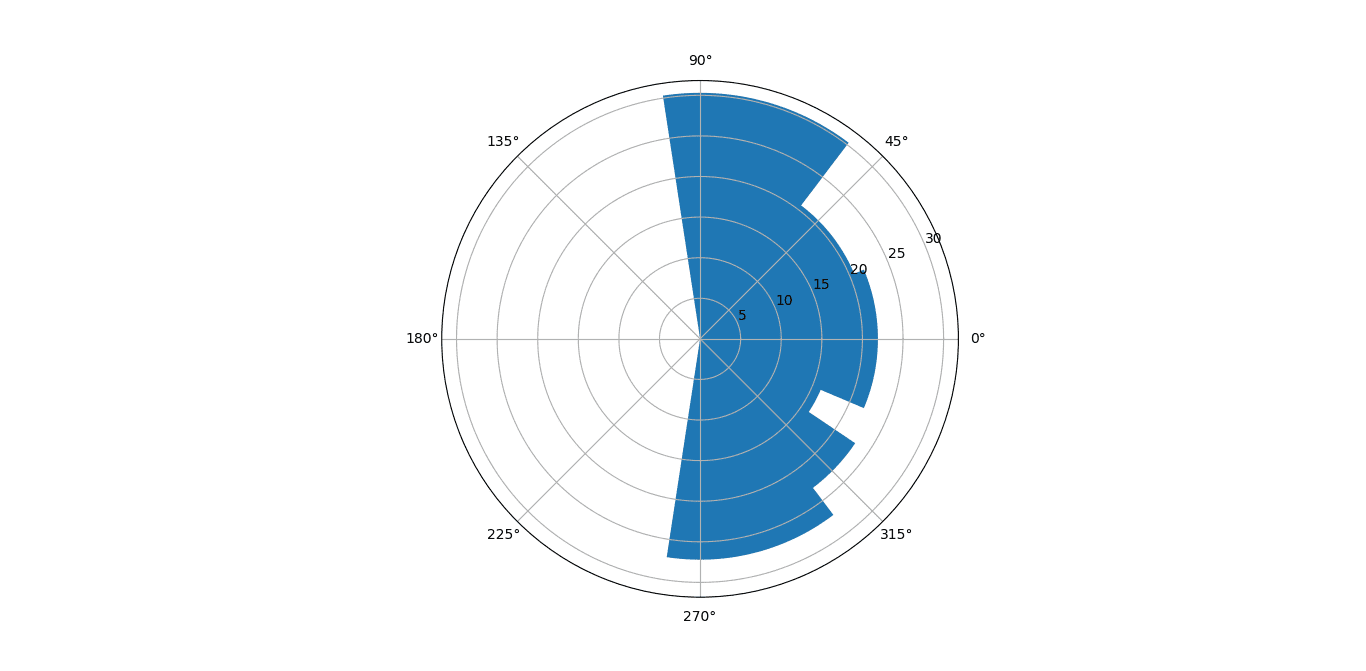
It obviously needs some work with the transparency of the different bars, bar widths, and colours but our code so far works.
Luckily, all of that is achievable in Matplotlib using its Object-Oriented API.
Plotting the sonars
Now that we know our code works for one player, we’ll go ahead and do it for the entire France team. We’ll use a for loop to loop through our “player_dicts” dictionary and send the player name to the Passer function and then plot the sonar at the x, y for each player.
Keeping that in mind, let’s use this function to do all that.
fig, ax = plt.subplots() def plot_inset(width, axis_main, data, x,y): ax_sub= inset_axes(axis_main, width=width, height=width, loc=10, bbox_to_anchor=(x,y), bbox_transform=axis_main.transData, borderpad=0.0, axes_class=get_projection_class("polar")) theta = data["Bin_Mids"] radii = data["pass.length"] bars = ax_sub.bar(theta, radii, width=0.3, bottom=0.0) ax_sub.set_xticklabels([]) ax_sub.set_yticks([]) ax_sub.yaxis.grid(False) ax_sub.xaxis.grid(False) ax_sub.spines['polar'].set_visible(False) for r, bar in zip(theta, bars): bar.set_facecolor(plt.cm.viridis(r)) bar.set_alpha(0.5)
Again, while a lot of the details may seem scary the base idea is the same as we discussed above.
We used Matplotlib’s axes customisation module to plot multiple polar axes on a base non-polar axis (of the pitch).
Next, we’ll need to call the function using the for loop and iterate over our dictionary.
We’ll also plot the names of the players in the same loop.
for player, loc in player_dict.items(): plot_inset(1.1,ax, data = Passer(player), x = loc[0], y = loc[1]) ax.text(loc[0]+10, loc[1], player, size = 5, rotation = -90)
Here’s what we get:
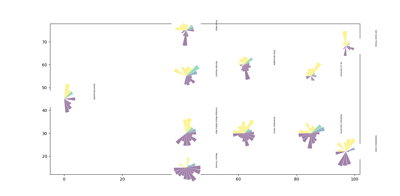
The final bit left is to plot a pitch which underlays the sonars, adjust the axes, as well as adding some descriptive text to our plot.
Let’s go ahead and finish this.
ax.plot([0,0],[0,90], color="black") ax.plot([0,130],[90,90], color="black") ax.plot([130,130],[90,0], color="black") ax.plot([130,0],[0,0], color="black") ax.plot([65,65],[0,90], color="black") #Left Penalty Area ax.plot([16.5,16.5],[65,25],color="black") ax.plot([0,16.5],[65,65],color="black") ax.plot([16.5,0],[25,25],color="black") #Right Penalty Area ax.plot([130,113.5],[65,65],color="black") ax.plot([113.5,113.5],[65,25],color="black") ax.plot([113.5,130],[25,25],color="black") #Left 6-yard Box ax.plot([0,5.5],[54,54],color="black") ax.plot([5.5,5.5],[54,36],color="black") ax.plot([5.5,0.5],[36,36],color="black") #Right 6-yard Box ax.plot([130,124.5],[54,54],color="black") ax.plot([124.5,124.5],[54,36],color="black") ax.plot([124.5,130],[36,36],color="black") #Prepare Circles centreCircle = plt.Circle((65,45),9.15,color="black",fill=False) centreSpot = plt.Circle((65,45),0.8,color="black") leftPenSpot = plt.Circle((11,45),0.8,color="black") rightPenSpot = plt.Circle((119,45),0.8,color="black") #Draw Circles ax.add_patch(centreCircle) ax.add_patch(centreSpot) ax.add_patch(leftPenSpot) ax.add_patch(rightPenSpot) #Prepare Arcs leftArc = Arc((11,45),height=18.3,width=18.3,angle=0,theta1=310,theta2=50,color="black") rightArc = Arc((119,45),height=18.3,width=18.3,angle=0,theta1=130,theta2=230,color="black") #Goals ax.plot([-3,0],[41.35,41.35],color="black") ax.plot([-3,-3],[41.35,48.65],color="black") ax.plot([-3,0],[48.65,48.65],color="black") ax.plot([133,130],[41.35,41.35],color="black") ax.plot([133,133],[41.35,48.65],color="black") ax.plot([133,130],[48.65,48.65],color="black") #Draw Arcs ax.add_patch(leftArc) ax.add_patch(rightArc) #Tidy Axes ax.axis('off') ax.text(135, 42, "PASS SONAR: FRANCE", rotation = -90, fontweight = "bold", fontsize = 12) ax.text(132, 59, "vs South Korea", rotation = -90, fontweight = "bold", fontsize = 7)
Here’s our final result.
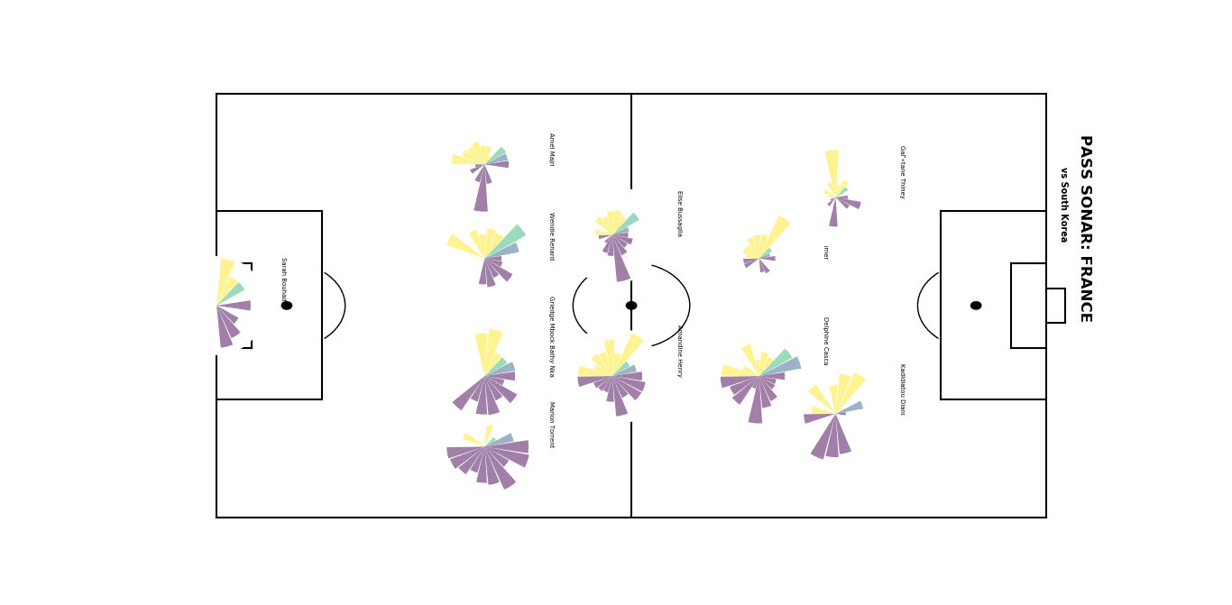
Areas for improvement
There’s quite a bit of work still left to do to get the best results.
For instance, we should probably not hard code the part about formations and instead bind it to another dictionary.
We could also add a colour bar to tell people the lengths of the passes.
I’m also figuring out how to stop the sonars from overlapping the pitch marks.
Another area to work on would be to link the bar colours to a statistic like pass completion rate.
If you can suggest a way to improve on any of those issues (or anything else), feel free to reach out.
Other than that, I hope this code demonstrated how easy it is to create stunning and insightful visualisations using Python.
For the full code in action, check out my GitHub repository here.
EDIT:
Since the publication of this piece, I’ve succeeded in resolving most of the issues mentioned in the last paragraph (adding color bars, removing overlaps etc.) and have updated the code in my GitHub repository.




Comments