The 2023/24 campaign has come to an end for most of Europe, including each of the Big Five leagues.
With a full season of data, this is the perfect time to look at each team’s body of work and look for tactical trends. In this data analysis, we will use statistics to evaluate defensive performances. More specifically, we will use the data to identify which clubs put in the worst defensive performances.
Performance-based statistics will help identify our focus group. Next, we will look at how teams manage tempo in their matches or perhaps how they struggled to control the tempo. Finally, we will look at more general defensive metrics and look for trends relative to how teams finished in their respective tables.
Though defensive performances can be difficult to measure since the statistics need the context of a team’s defensive tactics, this broader approach will help us move from a data analysis towards a more nuanced look at defensive underperformers in a couple of weeks.
Let’s start with the data.
Finding the defensive underperformers
As we begin our data analysis, the first step is to identify which teams rated poorly with respect to the field. We want to get a sense of which teams were not only conceding the most goals but also allowing the highest xGA per game. That gives us a sense of both the highly concrete feedback tied to the final scoreline and indicators that are more predictive of performance.
Before moving to our first graph, one note is that we’re not only looking for a team’s defensive performances but also how poor defensive showings impact their spot on the table. There is some missing context, given that we’re not looking at the other side of the coin, attacking production. Teams that struggle to keep the balls out of the net are likely to also struggle at the end other end of the pitch. In an era of bloated team salaries and staggering player values, the “haves” should outperform the “have nots” across the board.
We’re going to focus on just the defensive angle today. As you look at these charts, the brighter the yellow plot point, the higher a team has finished in the table. As it blends to a faint yellow or pale pink, those are the mid-table teams. The brighter the pink a club has, the lower it finished on the table. This gives us some feedback on the impact of a team’s defensive quality on their final spot on the league standings.
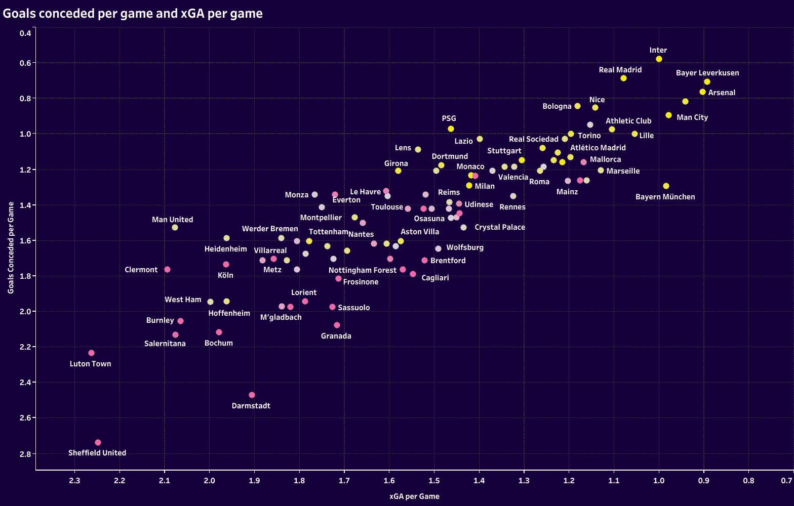
Our first graph plots goals conceded per game against xGA per game. The top right quadrant represents the best defensive performances across UEFA’s top five leagues, whereas the bottom left gives us the teams conceding the most goals and the highest xGA per game. Poor defensive performances didn’t stop West Ham, Hoffenheim and Manchester United from securing spots in the top half of the table. While strong performances in these two categories aren’t exclusive to the top half of the table, as we see with a very strong defensive season from Mallorca in La Liga, there is a general trend that the best teams defend well and the worst teams struggle to keep the ball out of the net.
That point is further backed up when comparing xGA to expected points. While every manager and player will take three real points on the league table over 1.8 expected points, we once again see a strong correlation between better defending and more points secured on average. The three defensive underperformers listed above remain in the bottom left quadrant, registering a below-average expected points per week match. Werder Bremen, Montpellier and Eintracht Frankfurt join the list of defensive underperformers, as do high-status clubs like Sevilla and Borussia Mönchengladbach, which endured poor seasons.
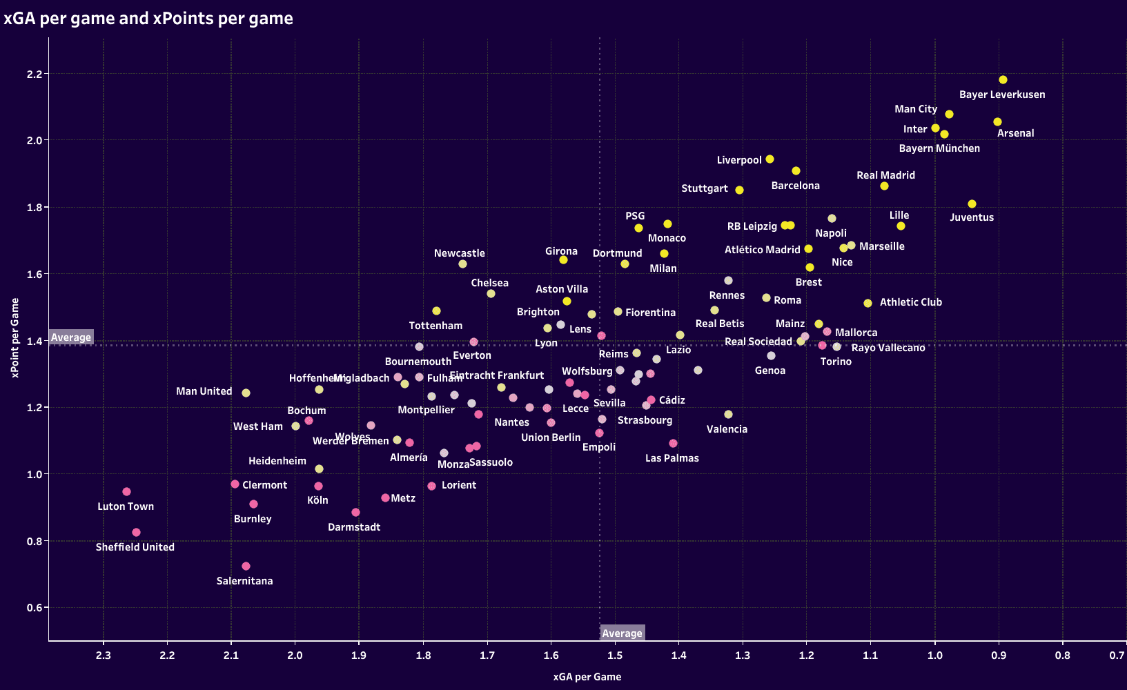
This is perhaps where we can get a sense of how a team’s attacking statistics complement their defensive performances. For example, Chelsea, Tottenham, and Newcastle rated below average in xGA per match, so to get a sense of their season performances on a more complete scale, we can turn to their attacking data to see if that’s the reason for their above-average xPoints per game.
For teams in the bottom left quadrant, it’s likely that they were poor performers in both defensive and attacking metrics. The bottom right are likely strong defensive teams but struggle to score goals, whereas the top left would feature our clubs where the attacking firepower carries the weight. Finally, the top right features the teams that are simply good on both sides of the ball.
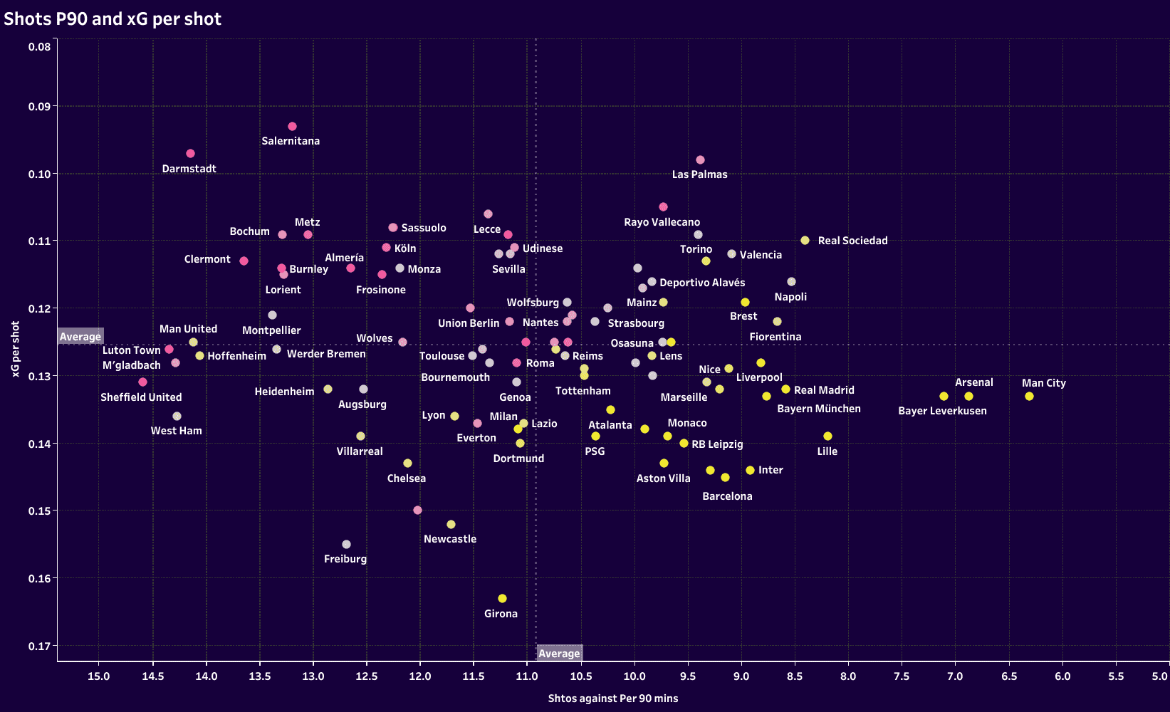
In our final graph for the section, we have shots P90 by xG per shot. This is a really interesting graph. The more successful teams tend to allow fewer shots. That seems like the obvious outcome, whereas the lesser teams and the worst defensive clubs tend to allow more shots. One point of interest is to see which teams that finished in the top half of the table are located on the left of the graph and further down the plot. Shifting our attention momentarily to the top teams, even though they’re admittedly not our focus, we do find that even though they allow fewer shots, they do tend to allow an above-average shot quality. The difference between the top-finishing teams in each league and those who finished immediately below them is often closely related to not how many shots they allow per game but the difference in shot quality. We won’t go into detail here, but just an interesting note.
As we move into the next stages of this analysis, we’ve already started to identify some defensive underperformers.
Controlling tempo
Whether a team has more of the attacking or defensive initiative in a match, the goal is always to dictate the terms of play. A club wants to engage the opponents on their own terms, be it in or out of possession. One aspect of dictating the terms of a match is how a team controls the tempo of play.
From a defensive standpoint, PPDA is commonly associated with the intensity of a team’s defensive transition. That is one aspect of it; another is the general length of the attacking sequences they allow. If a team has a less intense PPDA number, they’re not only less eager to recover the ball in transition, but they’re more likely to let the opponent keep the ball while reducing the space and prioritizing structure.
Challenge intensity factors in as well. That’s the defensive sibling of match tempo as it calculates defensive duels, loose ball duels, interceptions and tackles per minute out of possession. A team’s number in relation to its counterparts gives a sense of how frequently it engages the opposition per minute, giving a sense of its tempo out of possession.
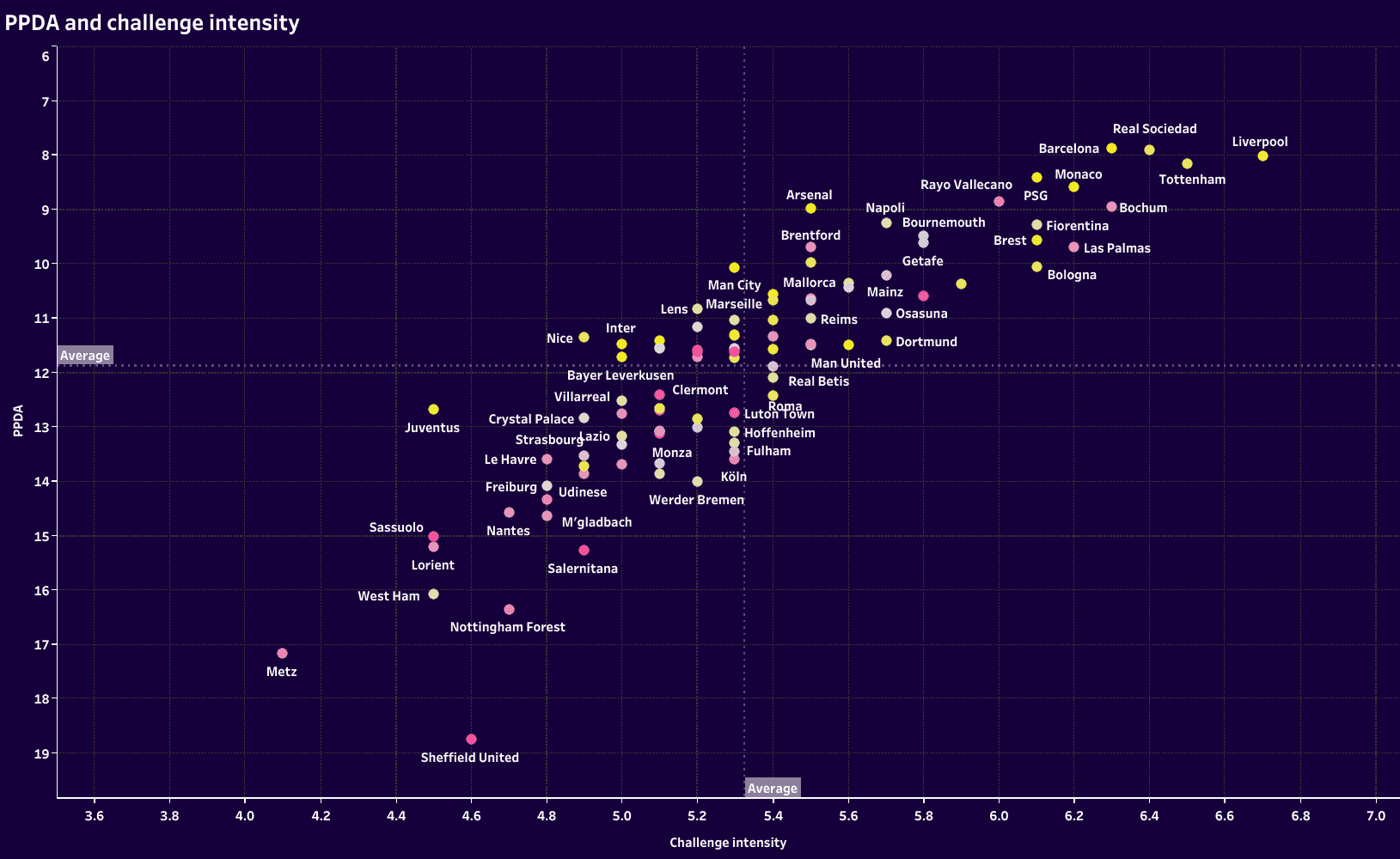
When combining the two defensive tempo stats, two pictures start to emerge. At the top right, we get the teams that press very intensely. It’s squads like Liverpool, Barcelona, Tottenham and Real Sociedad. Between that top bright yellow group and the next yellow cluster in the centre of the graph, there’s an array of lighter yellows and pale pinks, as well as a few darker pinks. We can read these as a similar approach out of possession but with greater intensity from the top teams.
Looking at the large group of yellows centrally, these are the teams that are more balanced in the way they impose themselves defensively. It’s perhaps not the objective to win the ball back as quickly as possible as it is that top-right group. Perhaps a better way to describe their defensive tactics is to engage the opponent only once they’re in a position of strength, at least whenever possible. In transition, they just don’t want the opponent breaking lines and progressing. As long as they play back, there’s an opportunity to reorganize and engage the opponent’s structured attack. Again, we have the teams who rate high on the table with this approach in the middle of the graph and teams of a similar or more conservative style below and fading downward to the left.
Another way to control the tempo of a match is to use fouls, including those of a tactical nature, to slow the opposition’s attack. Once again, the stats are flipped, so fewer fouls and yellow cards are in the top right quadrant, whereas more fouls and yellow cards are in the bottom left.
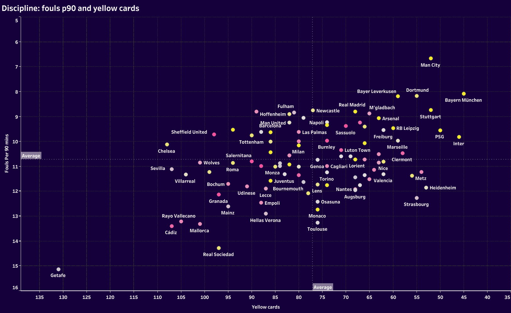
Looking at some of our teams that rated poorly in the last section, we see Chelsea with a below-average number of fouls but one of the leaders in yellow cards. Sevilla isn’t far from the London club, either.
This graph is far less indicative of defensive success or underperformance, but it does frame the approach of teams that have already received a shout in the role call.
General defensive metrics
To round out the data analysis, let’s look at some of the other categories listed on Wyscout. As with fouls and yellow cards, don’t take this section as indicative of a team’s defensive quality because it does lack the context of their match tactics. Some teams will have more of the ball, whereas some have less, limiting their opportunities to engage in these defensive actions.
Additionally, the way a team chooses to defend has significant implications on the way these remaining categories play out. We’ll see some very clear trends that correlate with teams that rate higher in the league table and those that are lower.
Rather than looking for signs of success or failure within these remaining categories, we’re simply looking for some trends. Our first section helped us identify some of the poorer performers in the most relevant defensive categories. The second section helped us get a sense of how teams set the tempo of the game through the way they defended. This section is a means of seeing how our defensive underperformers fared in these specific categories.
Plotting interceptions P90 and challenge intensity together, we get a sense of how a team’s pressing tactics positioned it to recover the ball. As you can see, it’s the top teams that generally have fewer interceptions per 90 minutes. Interestingly, teams like Manchester United, West Ham and Werner Bremen finished in the top half of the table and have shown up in the wrong parts of previous graphs, but they’re also are among the leaders in interceptions.

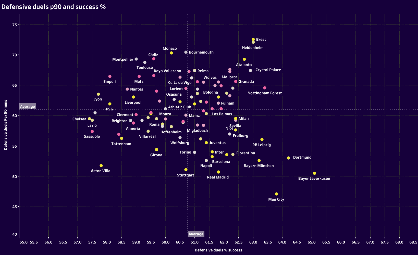
In terms of defensive duels, the best teams tended to face fewer of them with many of the top teams winning an above-average percentage. The teams in pink, representing the bottom half of the table, tended to engage in more defensive duels P90, though it must be said that their success rate tended to cover a wide range among the teams that we have already pointed out, Chelsea and Tottenham fare on the below-average end of the success spectrum. Monaco, which has popped up several times in surprising areas, engaged in one of the highest rates of defensive duels, P90, across each of the top five leagues and had a below-average success rate.
Finally, with aerial duels, the clear pattern is that better teams tended to face fewer of them and had a higher success percentage. In all likelihood, they’re facing fewer crosses and are largely facing passes into the forward line, where they typically have a numeric advantage. Of the teams highlighted, few are in odd positions, but we do see Manchester United at the bottom left, facing fewer aerial duels per game but also rating among the worst in the data set. They’re joined in the bottom left quadrant by Lazio, Aston Villa, Real Betis, Girona and Tottenham.
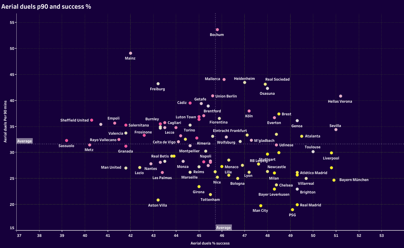
Suppose there are any interesting points in these last three images. In that case, it’s in finding that some of our defensive underperformers from the previous two sections tended to find themselves distant from teams of a comparable status. You would expect a club of Manchester United’s stature to find itself in the company of Real Madrid, Bayern Munich, Arsenal and Manchester City, but they frequently fell adrift. The same goes for Chelsea and Tottenham. While these statistics don’t necessarily point towards underperformance, they do give a hint as to which teams fell out of their typical company.
Conclusion
While defensive stats can often be misleading or lacking context, they give a hint of where to look as we study the habits of underperforming defensive teams across the UEFA Big Five leagues.
Manchester United’s struggles are clearly seen in the data. West Ham’s season comes under similar scrutiny. The same can be said for Chelsea and Tottenham, though to a lesser extent.
In Germany, we see the placement of Hoffenheim, Heidenheim and Werner Bremen at the top half of the table, but we also see their defensive vulnerabilities. The same can be said for the underperforming Borussia Mönchengladbach.
We have a guide. A guide that will help us identify tactical trends in a follow-up article. We’ve identified some of the defensive underperformers in Europe. The next step is to look at the film and identify what exactly has gone wrong.
Check back in two weeks for the follow-up tactical analysis of defensive underperformers.




Comments