Two weeks ago, we released a data analysis on NCAA D1 men’s soccer.
This week, NCAA D1 women’s soccer takes the mantle.
Using each of the profiled teams’ complete data from the 2023 season, this data analysis will look at the key performance metrics and build out a data-driven look at each team’s attacking and defensive tactics.
To add context to the graphs in this article, giving an explanation of the data set is important.
For those who are unfamiliar with NCAA D1 women’s soccer, there are 347 teams.
That’s 136 more teams on the women’s side than the men’s, meaning far more data to piece through for a comprehensive data set.
Rather than listing every team, the approach for this article was to include each program in the RPI top 100, as well as Power Five schools outside of that range.
This NCAA D1 women’s soccer data analysis is designed to show the performance indicators of NCAA D1 women’s soccer top teams.
It’s packed with insights on the top-performing teams.
We’ll see how they construct play in attack and identify tendencies in the press.
NCAA D1 women’s soccer Performance based statistics
For anyone who did not read the men’s data analysis, in this section, we’ll look at statistics that are more broad performance indicators.
Points per game and goals for and against are the most common indicators, but we wanted to dig a little deeper into the data.
Just like the men’s article, we’ll look at the expected values of goals for and against.
By matching xG and xGA, we can get a good sense of the value of the chances created, as well as a team’s ability to limit the opposition’s chances on goal.
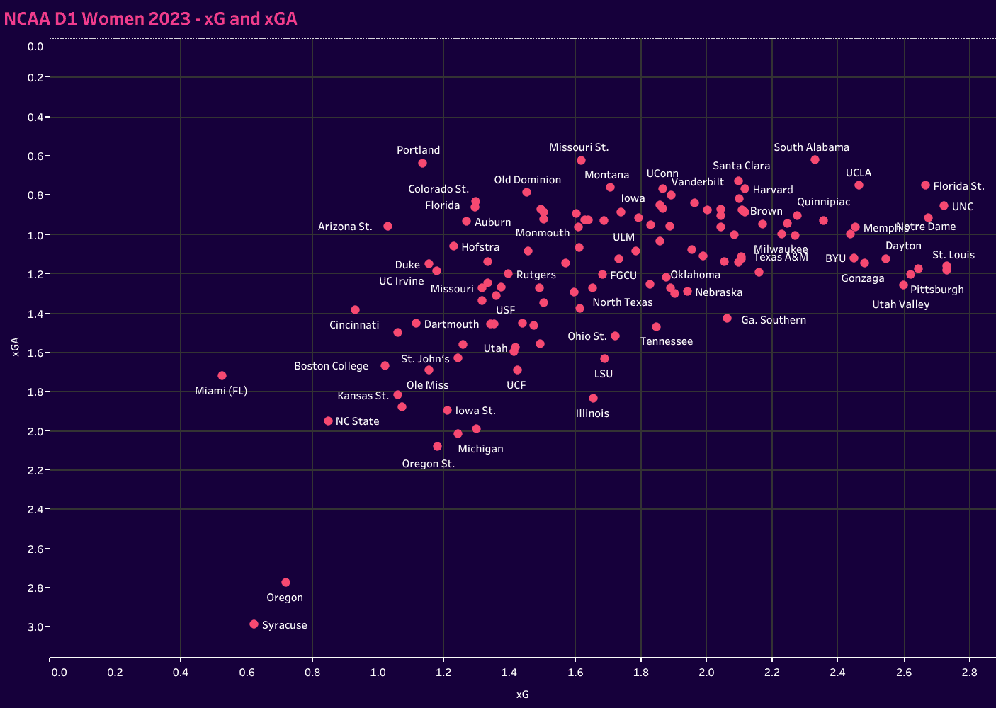
On our first chart, which plots xG and xGA, the top right quadrant is where a team wants to be.
The ACC, including national champions Florida State and the stars of the NWSL draft, UNC (who also had a player sign for Sampdoria in Serie A Women just before battling Napoli), are joined by Notre Dame in the most exclusive part of the chart.
In terms of chance creation and defensive strength, these three programs are in a class of their own.
UCLA is in a fantastic position, as are South Alabama, Memphis, Dayton, St.Louis and Pittsburgh.
Focusing now on the creation and finishing of goals, we put xG and goals in relation to each other.
Falling below the trend line is an indication of underperformance in converting opportunities.
The higher a team sits above the trend line, the more lethal they were in finishing off their chances.
Again, it’s that top right portion of the graph that showcases our top teams.
Florida State, St. Louis, Texas, BYU and Utah Valley were exceptional in both creating opportunities and scoring.
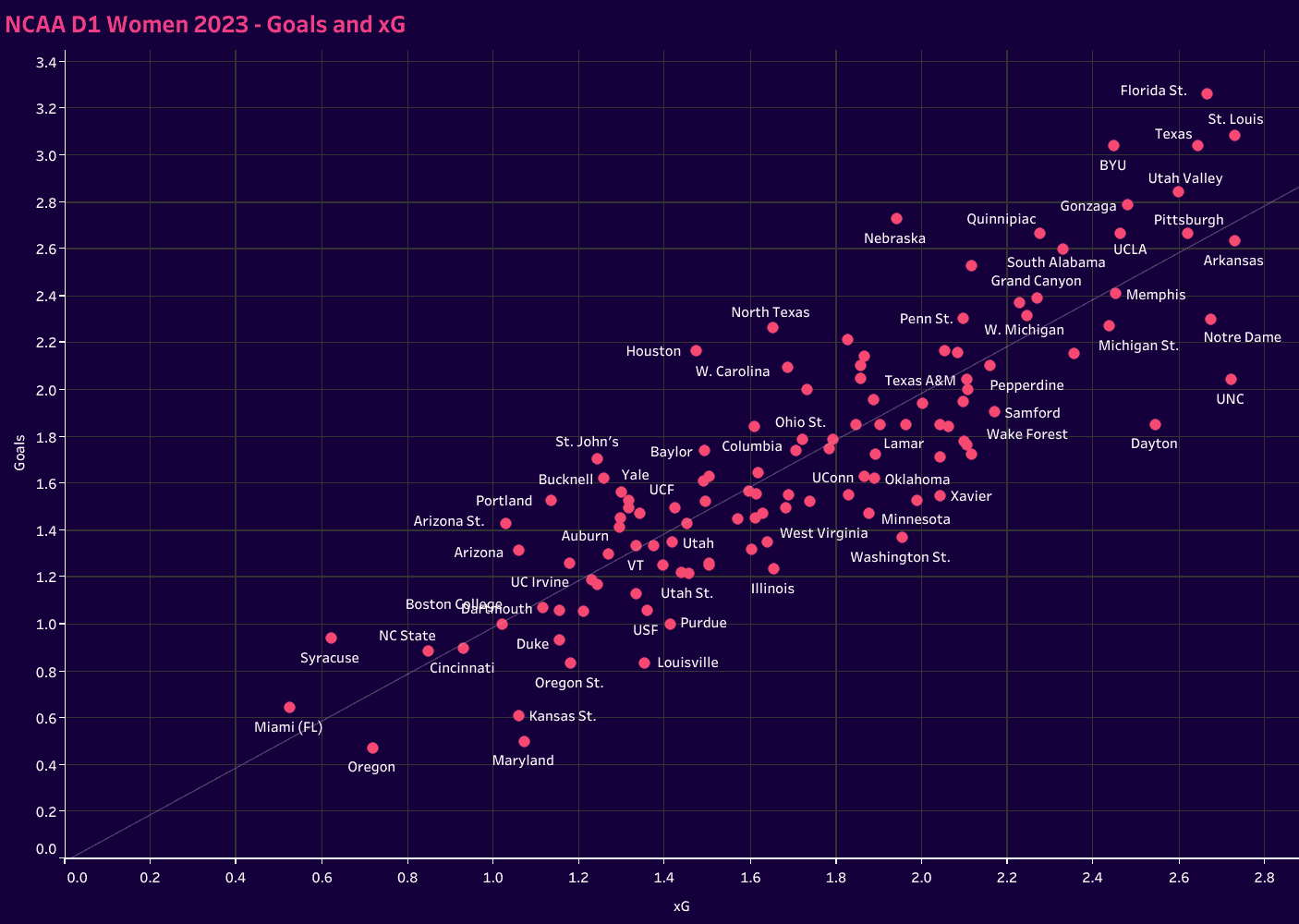
Some programs, like Nebraska, North Texas and Houston, were wildly efficient in front of the goal.
On the other hand, Notre Dame, UNC and Dayton struggled to capitalise.
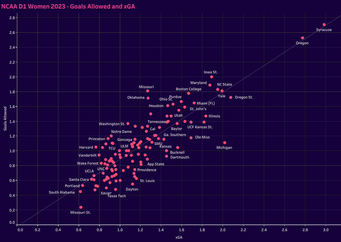
In plotting goals allowed and xGA, we see not only the number of goals a team could have reasonably expected to concede per game, but we also could match that against the actual goals against per game.
The value here is in assessing the relationship between the two numbers.
If the xGA is higher than the number of goals allowed, there’s typically strong play by the goalkeeper or some degree of fortune in the opposition’s lack of clinicalness.
For the inverse, we might look at goalkeeper errors or fantastic finishes from low xG opportunities.
Missouri State takes the pole position in this one, claiming that outlier spot at the bottom left of the chart.
South Alabama, Portland and Santa Clara all enjoyed excellent defensive seasons and stayed right along that trend line, indicating that they conceded an expected average per game.
With these baselines, we’ll move into attacking and defensive statistics.
Looking at that data will help us see the styles of play within each of the represented programs.
Let’s start with the attacking tactics first.
NCAA D1 women’s soccer Data on attacking tactics
The objective here is not so much to look for results-based measures as it is to evaluate statistics with a higher correlation to how teams construct play.
We want to get a sense of their patterns in possession.
One way to do that is to plot positional attacks and counterattacks on a chart.
A team’s distribution gives an indication of how likely they are to rely on controlled, structured attacks to move forward versus a heavier reliance on counterattacking.
On this chart, the top right quadrant features teams that have a blend of each and are more dynamic in getting forward.
The lower right quadrant features a greater reliance on counterattacking, which is opposed to the top left, which features teams that are most likely to progress up the pitch through positional attacks.
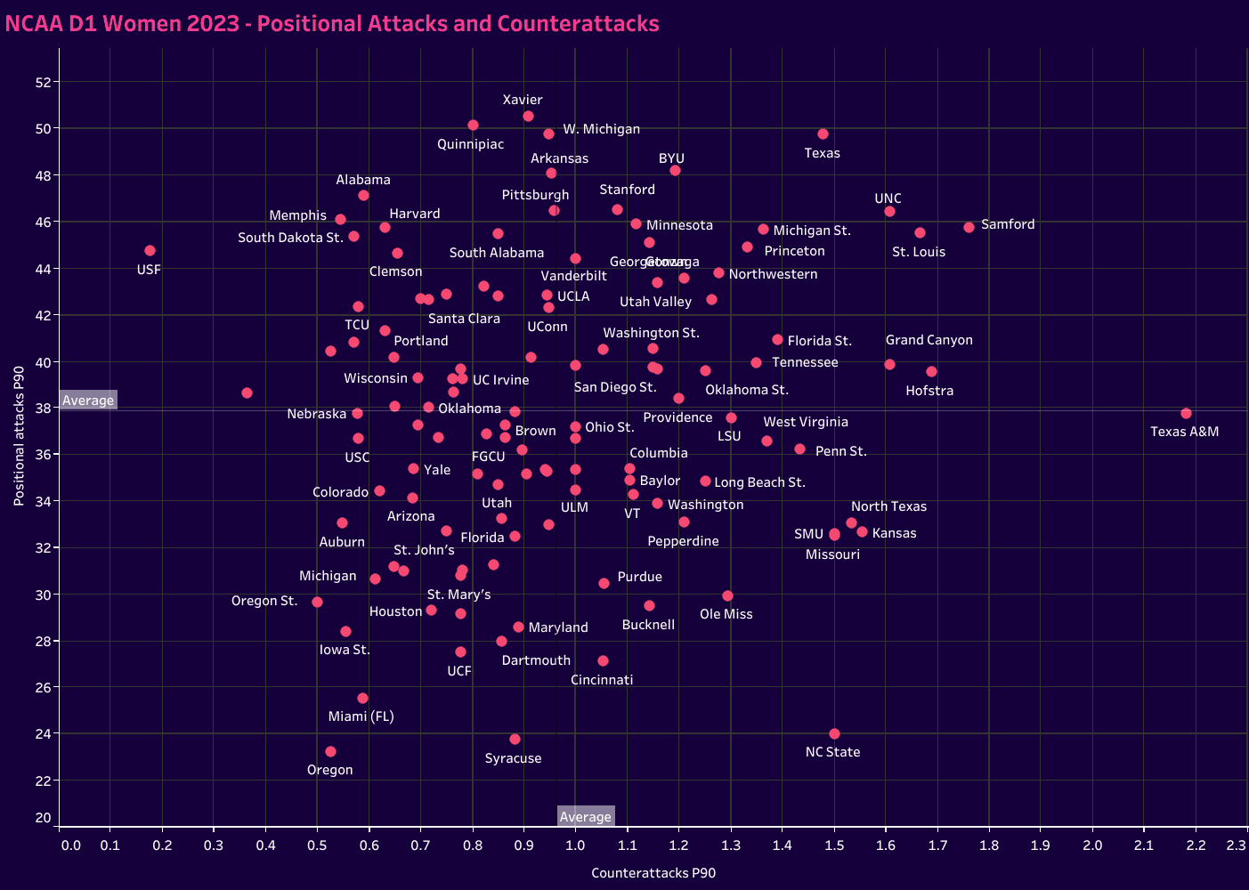
The lower left quadrant is a tricky one.
If the full listing of NCAA D1 women’s soccer programs was included, this is typically where you would find the less dynamic attack in teams.
It would show teams that struggle to get forward regardless of attack type.
Given that this data set primarily features the top teams of the women’s game, the left quadrant is more relative.
Compared to the represented teams, these groups are perhaps less dynamic in getting forward, but the true value is in evaluating the balance of their position along the two axes.
If the resulting shape is more rectangular, there’s a tendency for one versus the other.
A more squared outlook would indicate balance in the attacking tactics.
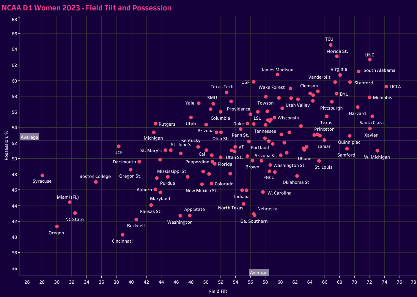
Turning to field tilt in possession, the former is calculated based on touches in the box rather than the standard approach of touches in the final third.
Our objective here is to get a better sense of dominance in a game.
We want to know how effective the team is in getting into the box and creating shooting opportunities.
UNC offers the best balance between the two.
They are both a high-possession team and one of the best in getting into the opponent’s box.
TCU and Florida State have better possession numbers.
At the same time, UCLA, Western Michigan, Memphis, Santa Clara and Xavier are slightly higher in field tilt, but it’s college soccer’s most successful program that rules the roost.

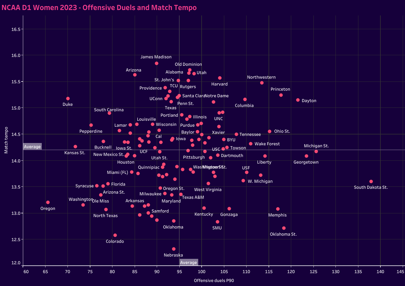
Next up is a correlation of match tempo and offensive duels.
Match tempo refers to the number of passes completed per minute of possession while offensive duels focus on the 1v1 attacks.
No one played at a higher tempo than James Madison, who was closely followed by Old Dominion, Arizona, Alabama and Utah.
South Dakota State was the most aggressive in 1v1 duels, followed by Michigan State and Georgetown.
Dayton, Princeton and Northwestern had the best combination of the two.
Turning towards passing types, we want to get a sense of how a team moves forward.
Are they more likely to send a long pass or keep the ball on the ground through intermediate-distance progressive passes? Do they systematically break down opponents with shorter distance passes, playing through the lines and getting up the pitch together?
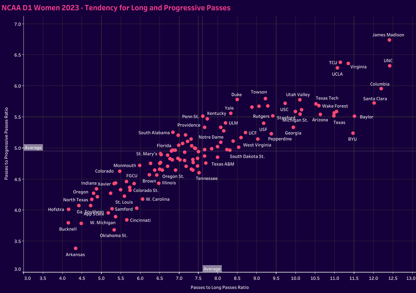
In this next graph, we’re looking for the tendency to play longer-range passes, plotting long and progressive passes relative to the number of total passes a team plays in a game.
The numbers represent the number of passes a team plays before playing one of those two types.
So, for example, James Madison and UNC keep the ball on the ground and move it quickly.
When they do push the ball forward, it tends to be through short-range passes or progressive passes.
At the other end of the scale, Arkansas and Bucknell are more reliant on long-distance passes to bypass the opposition’s press.
This data helps us build an understanding of an opponent’s style of play in possession.
While not comprehensive, we certainly get a sense of each team’s tendencies in possession.
NCAA D1 women’s soccer Defensive analysis metrics
Let’s do the same thing on the other side of the ball.
Using statistics, let’s build out an analysis of each team’s preferences when defending.
To start, let’s figure out which teams were most effective out of possession.
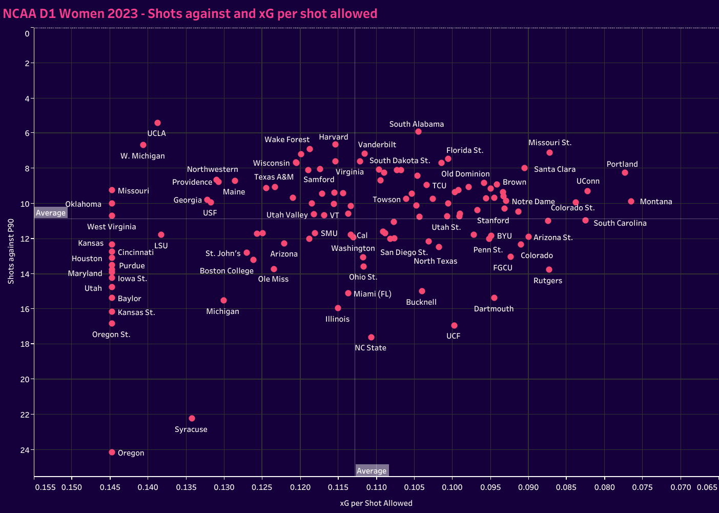
Though we already have a sense of those teams from the chart on goals allowed and xGA, we also want to get a sense of the number of shots a team concedes per game, as well as the quality of those shots.
That’s where we get our first graph.
The place to be is again on that top right quadrant.
That’s where we find the likes of Missouri State, Portland, UConn and Santa Clara.
These teams allowed few shots per game.
Additionally, they were lower-value scoring opportunities.
The bottom left features the teams that gave up a lot of shots, many of which were high quality.
On the top left, we have teams that did not give up many shots, but when they did, they were high value, whereas the bottom right teams gave up more shots but of a lesser quality.
Now, let’s move to pressing types.
This first chart will help us identify teams that place a greater emphasis on the high press and counterpressing.
The top right quadrant features the teams with the most high recoveries P90 as well as low PPDA, so quicker in the counterpress and limiting the number of passes allowed before a defensive engagement.
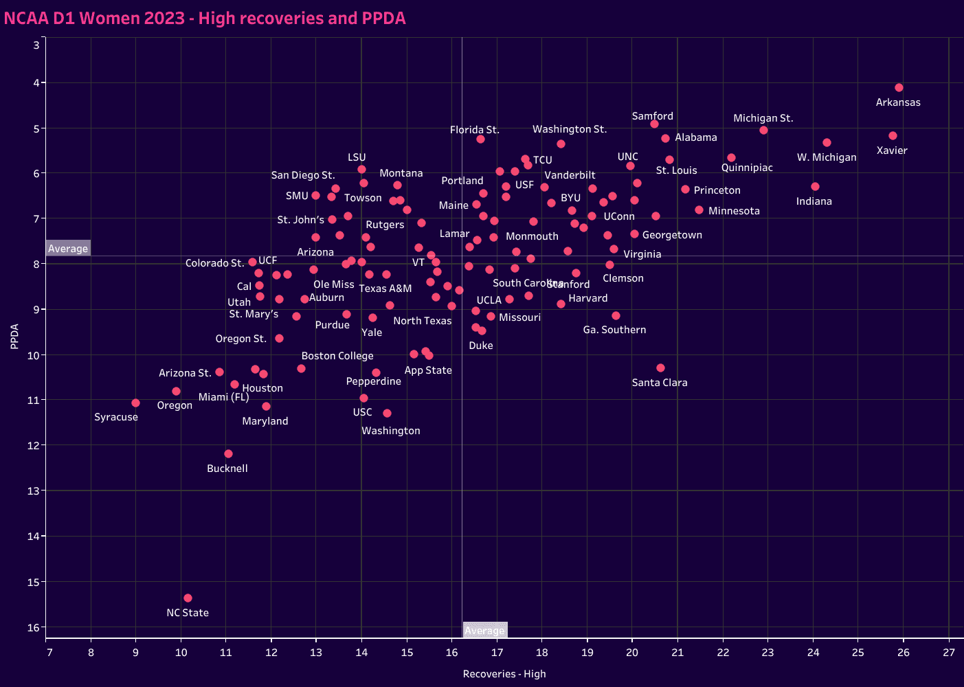
Arkansas, Xavier, Western Michigan and Michigan State are the standouts in this chart.
They are the most effective in winning the ball high up the pitch and quickly closing down opponents.
Samford, Washington State and Florida State also performed well in PPDA, while Indiana, Quinnipiac, Minnesota and Princeton performed well in the high recoveries category.
Finally, looking at medium and low recoveries, we do find that many of the programs with excellent numbers in the high press also perform well in the medium recoveries category.
Their aggressiveness to push up the pitch in an attempt to regain the ball often results in middle-third recoveries.
Samford, Xavier and Arkansas are all leaders in high and medium recoveries.
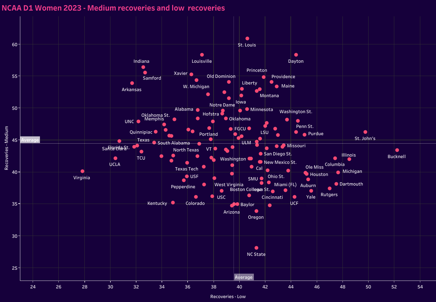
In the NCAA D1 men’s soccer data analysis, the top performers in the nation didn’t necessarily rate higher medium recoveries, but they did tend to have fewer low recoveries.
Without a complete database of D1 women’s teams, we can’t quite make that assumption, but it is noticeable that many of the top-rated teams are found on the left half of the low recoveries average line.
Conclusion
Data is a powerful tool.
While it doesn’t tell the complete story, we can see the development of team profiles.
Not only can we use basic and more known statistics to assess a team, like possession percentage and goal differential, but we can also go much deeper into the data that’s available through Wyscout to construct a more comprehensive team profile.
The value here is twofold.
First, it’s a helpful way to scout the opposition.
Using data forces teams to look at concrete evidence of playing styles.
Secondly, we can use the data to create statistical baselines and track KPIs throughout the season.
The spreadsheet took some time to put together, so given the two or three matches NCAA teams play in a given week, it’s unrealistic to update the database from scratch game to game.
However, there are strategies teams can use to leverage the data in their favour and have a concrete visual of their performance relative to the top teams in the women’s game.
There are clear advantages to be gained when programs leverage data.
Figuring out which metrics are most pertinent to their game model and creating an efficient approach are the next steps.


Comments