A decade ago, stats were used as complementary sides in football discourse. Nothing more than shots on target and possession were discussed when going over the events of the game.
Statistics were like the cranberry sauce placed on the edge of the plate during your Christmas feast – tasty, but not necessary for the meal to taste good.
Stats were largely just mini-context providers slapped onto your television screen during a match to offer a little data insight about which way the game swayed.
However, these metrics were often shallow and meaningless. Having 30 shots on goal means nothing if they were all from range and none hit the target.
Around the same time, Opta analyst Sam Green brought forward a new metric that would revolutionise football while creating a division between the more analytical thinkers and the game’s purists: expected goals.
Fast forward to 2022 and the world’s leading football broadcasters such as Sky Sports now use xG while the FIFA World Cup introduced stats such as ‘forced turnovers’ and ‘final third receptions’ during games.
Stats are no longer a complement to the eye test. While the latter is arguably still the most important, data can provide us with a whole picture of how a match unfolded without even setting our eyes on the game itself.
Data is now a way to confirm what you’ve seen, a method to check your biases and is only becoming more and more important in the sport to the point where top clubs have their own data departments, including many data analysts providing feedback to the coaching staff.
At Total Football Analysis, we’ve been doing our own bit to bring our readers daily stats packs of games from all corners of the globe, whether it be from the Premier League, the A-League, the Copa Libertadores or even the MLS. We’ve got you covered.
In this data analysis piece, we’ll be talking you through how to read our stats packs to get the most out of your viewing experience. This article will offer insight and analysis into how to understand our data visualisations better in order to leave with a grasp of how the games unfolded, without even needing to have laid eyes on the match.
To do so, the example we will use is the Premier League’s opening fixture on Boxing Day between Brentford and Tottenham Hotspur. Let’s get into it.
Lineups, average positions, heatmaps and touch maps
In the stats packs, the data is provided by Wyscout and Analytics FC and while they may not have as many in-depth metrics as FIFA were using during the Qatar World Cup, it does mean that TFA can cover quite a lot of bases, including average positions, xG, shots assists, high regains, chance creation, ball progression and much more.
First and foremost are the lineups from the two teams. This image sets out the starting eleven across both sides as well as the formations that each manager has chosen to use from the get-go.
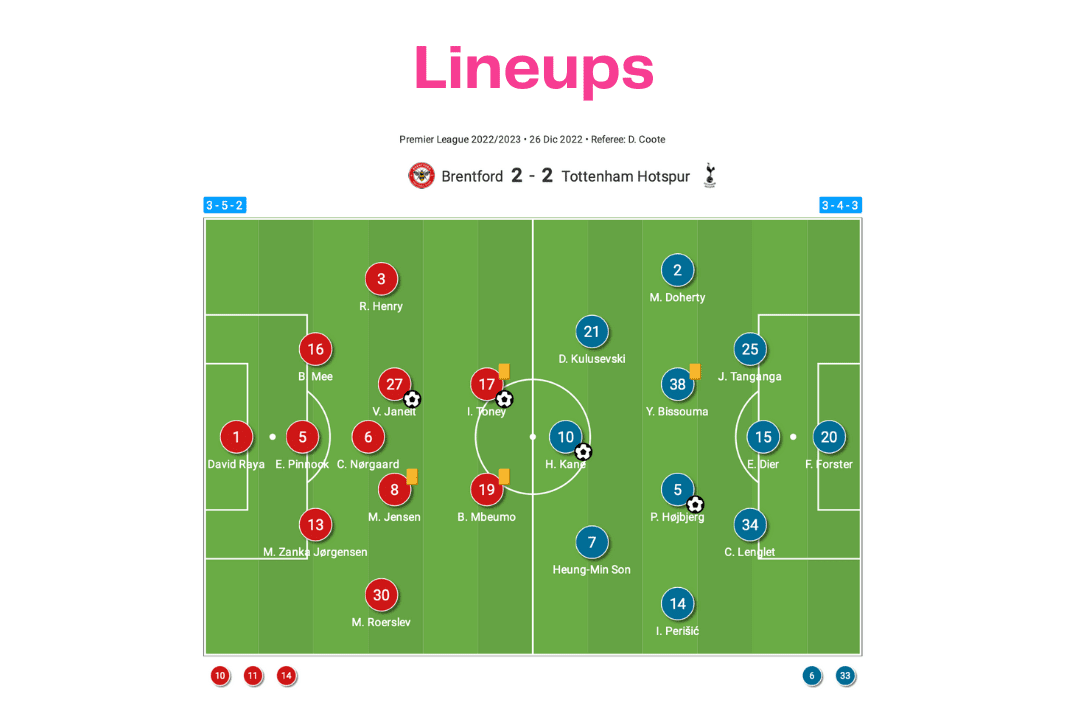
As we can see, Thomas Frank deployed a 3-5-2 compared to the visitors’ 3-4-3. This is basic information and there’s not much to explain here. The starting elevens just provides the reader with a clear understanding of which player played in each position within the coach’s structure, so you have a clearer understanding of what’s to come.
What is more interesting is the average position map. Ultimately, formations mean very little. Manchester City and Liverpool set out in a base 4-3-3 formation, but the shape rarely resembles this quantified order.
In the modern age, players move all over the place. Fullbacks push high, midfielders drop low, centre-forwards drift wide, and wingers invert. Positions are not as set in stone as they once were.
For this reason, the average positions map in the stats pack is so important, showing how high, low, wide or narrow a player was during the possession phases in relation to their teammates within the set formation.
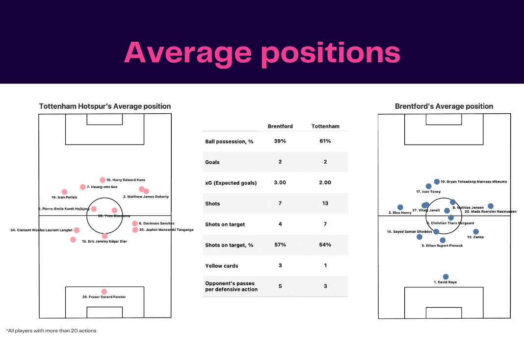
For instance, from the Brentford-Spurs match, the average positions map tells us that the Bees’ keeper David Raya was sitting really high, mostly outside the penalty area. What can be gauged from this is that the Spaniard was vital for Brentford’s build-up play from deep.
Furthermore, Bryan Mbeumo registered a higher average position on the pitch than his strike partner Ivan Toney. From this, we now know that the Cameroon international was making more runs in behind than the Englishman.
Brentford’s opening goal came from this very situation as Mbeumo latched onto a ball in behind the Spurs backline before eventually crossing it into the box.
The average positions map also displays the depth of a side’s average positional attack. Brentford and Tottenham boasted a similar height, depth and width but this won’t always be the case.
To complement this, TFA implements heatmaps into that stats pack directly afterwards. Where average positions map gives us precisely where each player would be on average, heatmaps are broader, portraying the rough areas that players would operate in.
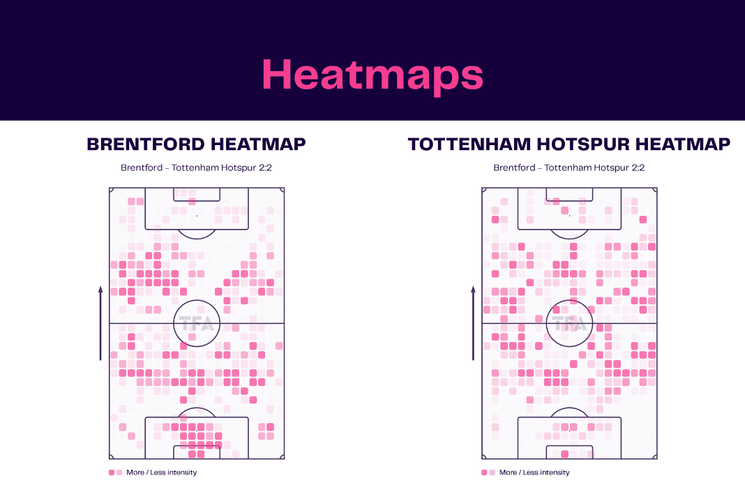
Look at Brentford’s heatmap compared to Spurs’. Frank’s side held way less possession than their opponents but the viz still offers insight into the primary areas where the Bees held the ball.
The London club had a lot of the ball around the backline, telling us that they were constantly circulating possession, trying to find gaps in Tottenham’s compact block while there was also a lot of action in both halfspaces as Brentford attempted to find their two advanced central midfielders, Vitaly Janelt and Mathias Jensen in these areas.
Meanwhile, most of the action from Antonio Conte’s team came from the flanks as opposed to the centre of the pitch. The 3-4-3 is a perfect shape for this as there are two wide players on either side and Spurs love to put balls into the box.
Both of Tottenham’s goals came from playing the ball into the box from wide positions.
The final aspect of our stats packs related to the team’s positioning on the pitch is the sides’ touch maps. Like heatmaps, touch maps don’t offer precision regarding a player’s average position on the football pitch but give a rough idea of what areas the team were receiving the ball in.
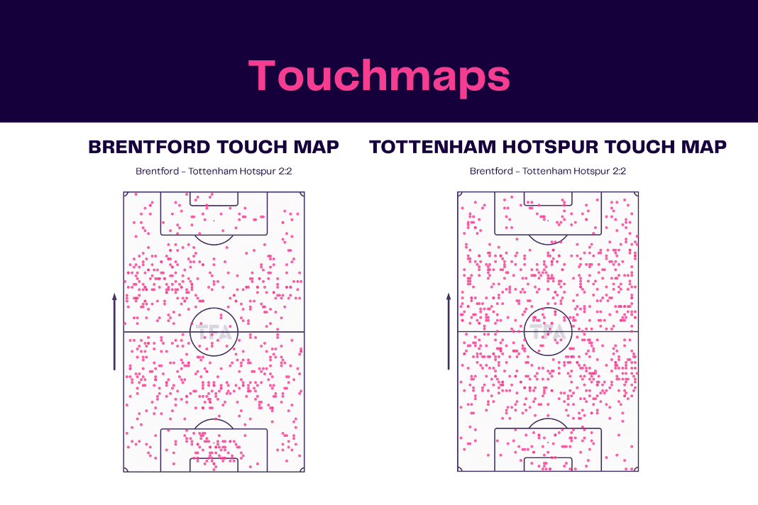
The touch maps from our example match between Brentford and Tottenham Hotspur are quite similar to the heatmaps. Again, we see that the hosts had quite a lot of touches around the halfspaces and in their own half as they looked to use the goalkeeper quite a lot to build from deep.
On the flip side, Spurs had far more touches out wide and even more in the final third than the home team. Brentford had very few touches in the final third, particularly in and around the box.
Nevertheless, it’s not about how many touches a team had in the last third. What matters most is what the players did with the ball and whether they were able to create clear-cut opportunities around the area. This brings us to the next stage of the TFA stats packs.
xG and chance creation
After garnering a great knowledge of how a team played during a game, the areas of the pitch they held the ball the most and their average positioning within the formation, looking at the xG stats is the perfect way to understand how the scoreline came to be.
The xG maps are pretty straight forward too for those familiar with the metric. For those unfamiliar, expected goals measures how likely a shot is to result in a goal. The less likely a strike will hit the net, the lower the xG number will be.
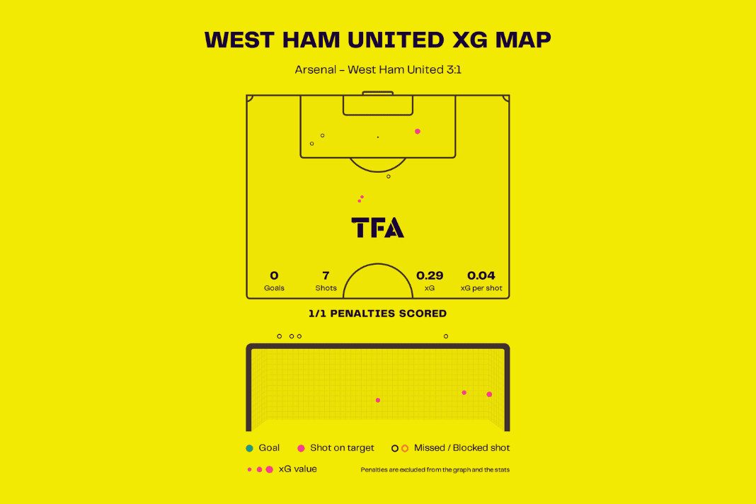
Penalties are fixed to a value of 0.76, meaning there is a 76 percent chance that a spot-kick hits the back of the net. However, penalties can come from nothing and often give a false representation of the xG balance during games.
For this very reason, penalties are excluded from the xG maps in the TFA stat packs but are mentioned below the data viz if any penalties occurred during a game. For example:
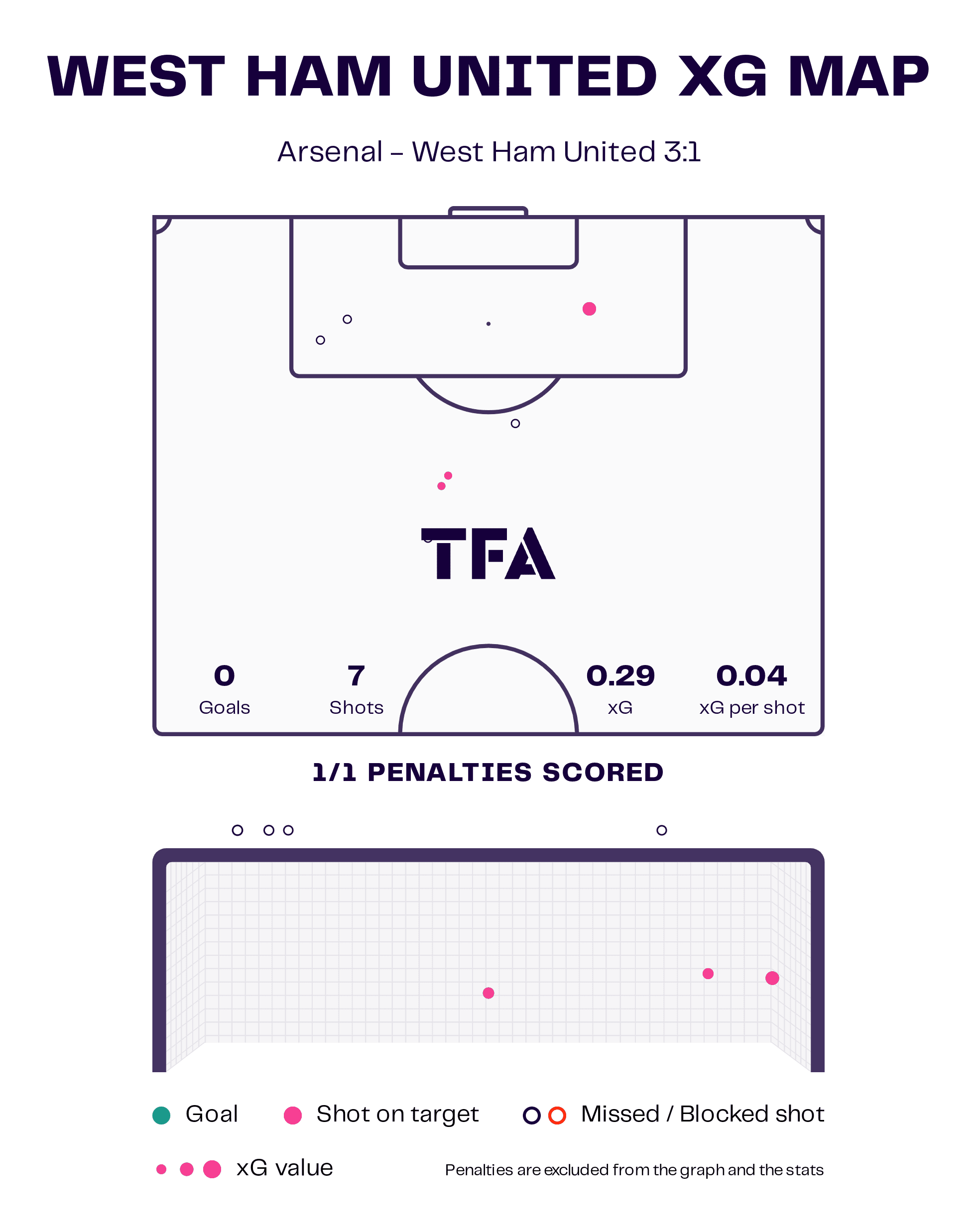
West Ham United registered an xG of 1.06 during Monday’s 3-1 defeat to league-leaders Arsenal. However, the penalty is discarded, leaving the Hammers with a meagre xG of merely 0.29 from seven shots.
Heading back to the Brentford versus Spurs clash, our xG maps can show whether a team underperformed or overperformed their expected goals in reality while also plotting the exact area that each shot was taken from.
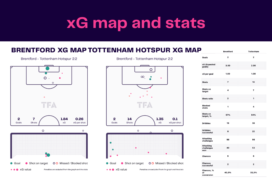
Brentford had seven shots as opposed to their opponent’s 14. A decade ago, this statistic would have been used out of context, leading many to believe that the latter were the dominant side.
However, from observing the xG stats closer, we can see that eight of Spurs’ strikes on goal were outside the penalty box in low percentage areas. The less xG a shot accumulates, the smaller the dot is in this data vizzes.
Brentford actually had a higher xG, boasting 1.84 to Tottenham’s 1.35. From this, we understand that Thomas Frank’s men had better chances with only half the opportunities.
The legend under each map acts as the perfect guide to know which shot had the most xG, which hit the target as well the strikes that either went in or flew wide.
Furthermore, in the TFA stats packs, there is an accompanying goal map which plots the exact height each shot went as well as the direction, so the reader can see what side was used the most.
However, what xG maps don’t tell us is whether these quality chances were being assisted by teammates or were the circumstance of an anomaly.
Goals can come from nothing. Sometimes an opposition defender will slip or one of the defenders will make a mistake and gift a wonderful opportunity to the attacking side.
Our shot assists maps take expected assists (xA) into account to show how many chances a team were creating over the course of a match.
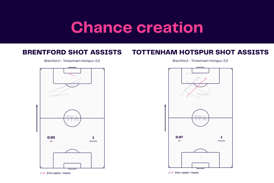
A shot assist is only registered if a pass leads to a shot being taken. Looking at Monday’s early fixture once more, we can see that both Brentford and Spurs were just as creative as each other.
The Bees ended the game with a slightly lower number of expected assists of 0.93 compared to Tottenham’s 0.97 but the two sides had one assist each in reality and so didn’t underperform their xA by much.
The data tells us how creative a team were, and so the xA map from this match shows that Brentford created better chances than Spurs from five assisted opportunities than their rival’s nine as the two teams boasted a similar number overall.
Relating back to the xG maps in correlation with the overall expected assists, this is about right as the hosts registered a higher xG on the day while having fewer shots on goal.
Possession stats
So far, after just two pages of the TFA stats packs, we’re getting a really good picture of how the events of the match between Brentford and Tottenham Hotspur unfolded without even needing to have watched the game itself.
But now, let’s go even further and take a look at the data behind the two sides’ stats in possession, how they created their chances and progressed the ball into dangerous positions on the field. These data vizzes are normally found on page three of the stats packs.
Next up is passing zones. For these vizzes, the field is broken up into 20 zones, using the Pep Guardiola-inspired pitch division.
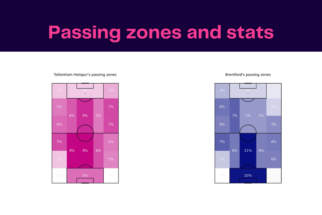
These data visualisations are quite self-explanatory. Essentially, each image displays the zones where the teams had the ball the most during the game, using percentages and dense colouring to make it clearer for you.
The darker the zone is, the more the side held possession in this area of the pitch. Again, these vizzes can tell a story about how the teams played.
For instance, Brentford had much more of the ball in their own box despite having much less possession than their opponents, showing that Frank was more willing to play out from the back with his goalkeeper than Conte.
However, Spurs were more proactive in the opposition’s half of the pitch and especially in the final third too, hence why the Champions League club created more opportunities on goal.
This becomes even more evident when observing the side’s pass maps from the game.
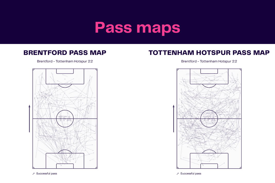
Once again, Brentford’s goalkeeper played way more passes than his counterpart, but Spurs played more balls in the home side’s half and into the last third of the pitch too. Given that Tottenham held the lion’s share of possession, it is also no surprise that the visitors played a lot more passes overall than the Bees.
What we can also see is that quite a lot of Spurs’ passes were made to the flanks. This is because Conte likes to create chances out wide, using his wingbacks, wide centre-backs and wingers, hence why the 3-4-3 formation is optimal for the Italian coach.
This feeds into our ‘penalty area entries and crossing’ visualisations for the two sides. These vizzes break down the precise areas that the teams crossed from as well as the zone where each pass into the penalty box started.
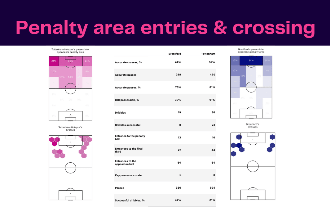
Once again, harking back to our case study example, we can see that Tottenham were more unpredictable with the positions they crossed from. At times, Spurs delivered balls from deep, but also used the byline quite a lot.
In fact, the two zones up the top left and right were used more than any other to place the ball into the mixer. Meanwhile, Brentford preferred to reach the box itself before trying to cross but particularly attacked down the left side, using left wingback Rico Henry as their primary outlet.
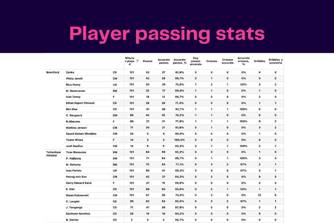
Accompanied by this data viz is individual player stats in the stats packs. When observing these metrics, the data backs up the previous point that Henry played more crosses than any other player for Brentford on the day whereas Spurs had a better mix.
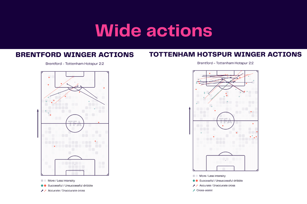
The same page includes the two teams’ ‘winger actions’ vizzes which display the precise areas that each cross was played from, the distance of these passes, as well as their accuracy.
Again, backing up the last two images, most of Brentford’s crosses came from the left, but what is particularly interesting is that the Bees were more successful from the right side. From this, we can take away that perhaps Brentford would have had more joy playing down the right side instead of leaning heavily on balls from the opposite flank.
Staying on the third page, the TFA stats packs also include vizzes such as ‘ball progression’ and ‘penetrating carries’.
These data visualisations help our readers to understand how dangerous each team were at progressing the ball up the pitch through carries as well as bringing it into the box which wraps up our attacking data.
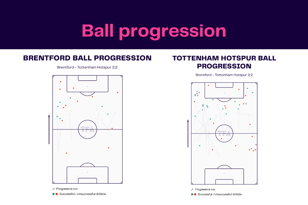
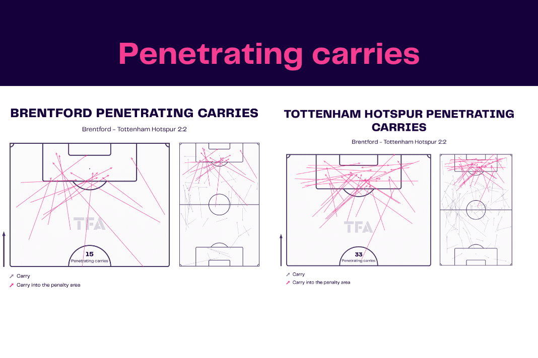
By now, you should have an excellent understanding of how each team played in possession, whether they passed it out from the back, which areas the side wanted to have the ball, how the managers preferred to reach the final third, their variations used to get the ball into the penalty area and create chances as well as how efficient both sides were in front of goal, yet not a single in-game image has been shown. The power of data is growing more and more year after year.
Defensive efficiency and pressing
However, offensive play is just one side of the game. In order to complete the full picture from the TFA stats packs, it’s important to look at the defensive metrics on show which are located on page four.
First up, breaking the pitch into 20 zones once more, our stats packs display the areas of the field where each team won the most tackles and interceptions, and aerial duels, as well as the areas where aerial duels were lost.
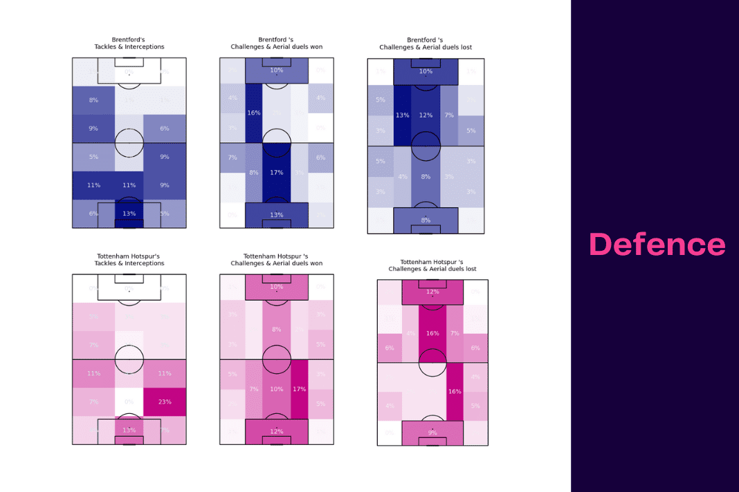
This can tell a great story of how adept the sides were at dealing with high balls into the box and where they were strongest defensively.
For instance, looking at Spurs’ aerial duels lost map, we can see that the Premier League giants were much weaker at dealing with high passes than their opponents. What is also evident is that Brentford were really strong in their aerial duels in and around the penalty box.
With this information in mind, we can now look at why.
Ivan Toney was the main reason. The 6’5” centre-forward was a menace in the air for the hosts and caused Spurs’ backline a lot of problems when Brentford went direct to him.
Furthermore, when observing the ‘tackles and interceptions’ vizzes, it is noticeable that Brentford did not make too many challenges in the final third and neither did Spurs, telling us that neither team pressed too high up the pitch.
This brings us to the defensive territory maps, which display the average defensive line of both sides as well as their average area of engagement.
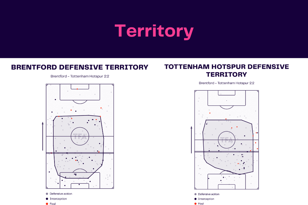
Backing up the point that the two sides didn’t press too high up the pitch, there were very few if any interceptions in the final third.
Moreover, the average defensive line height for both Brentford and Tottenham were well inside their own half which tells us that both managers preferred to sit a little deeper and not engage higher up the field where they could be played through and exploited.
The home team, in particular, defended much deeper in their defensive block, opting to stay compact and keep the middle of the pitch secure.
If that wasn’t enough proof, our ‘high regains’ maps tell us exactly how many successful combined tackles and interceptions were made in the final third.
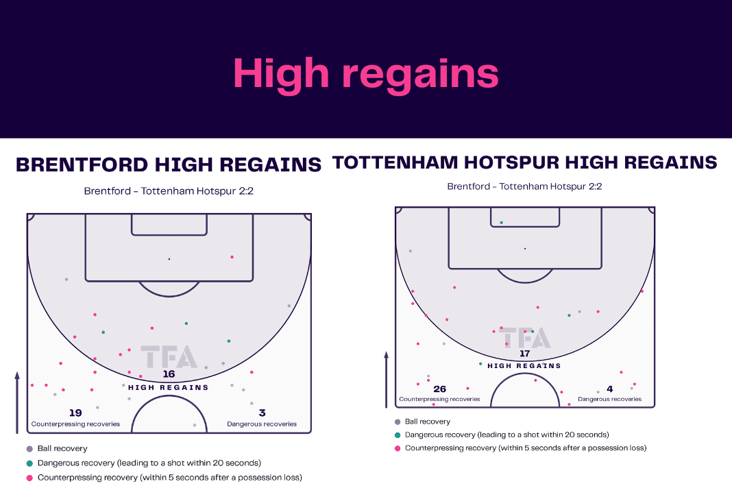
Brentford registered 16 high regains to Spurs’ 17 which is a relatively low number. However, it is also important to note the number of counterpressing recoveries made.
Spurs trumped on this front, showing an innate ability to win the ball back as soon as possession was turned over which was an impressive showing by Conte’s men and can be seen as one of the reasons why they had so much of the ball for long periods of time.
Miscellaneous
By now, the picture of the game has been made abundantly clear for you, defensively and offensively. However, there is some more complementary data available in the TFA stats packs to digest.
While the performance of each team in front of goal was analysed, it’s also important to look at the performance of the two goalkeepers on the night to see their contributions for their sides.
In our case study fixture, both Raya and Fraser Forster conceded the same number of goals in the 2-2 draw at the Brentford Community Stadium.
Nevertheless, looking at the data available, it’s fair to say that the home goalkeeper put in a finer display than his counterpart, registering a higher shot-saving percentage despite facing almost double the number of strikes and two more close-range shots as well, although Forster did save more close-range chances than Raya.
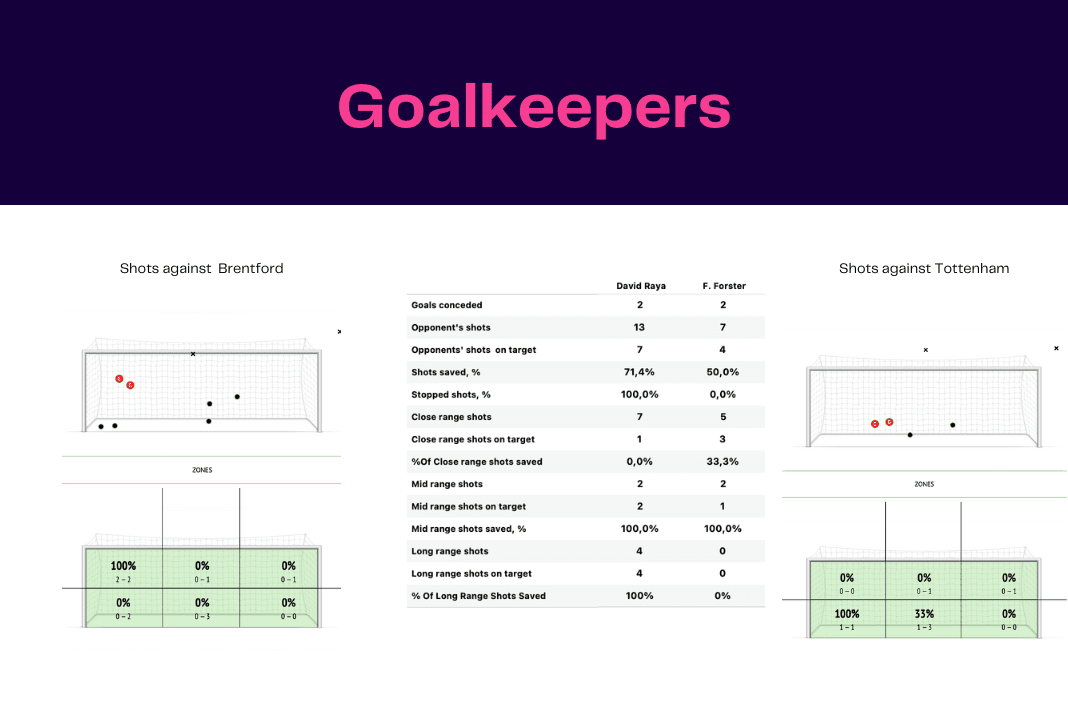
In addition, the data visualisations tell us that both of Spurs’ goals were in the top left-hand corner of the net, making it far more difficult to save.
And lastly, the TFA stats packs’ final page, which is normally page six, include our picks for the two key players on the night, comparing their involvement both offensively and defensively.
In this match, we picked out Toney and Kane, two men who got themselves on the scoresheet with a goal apiece.
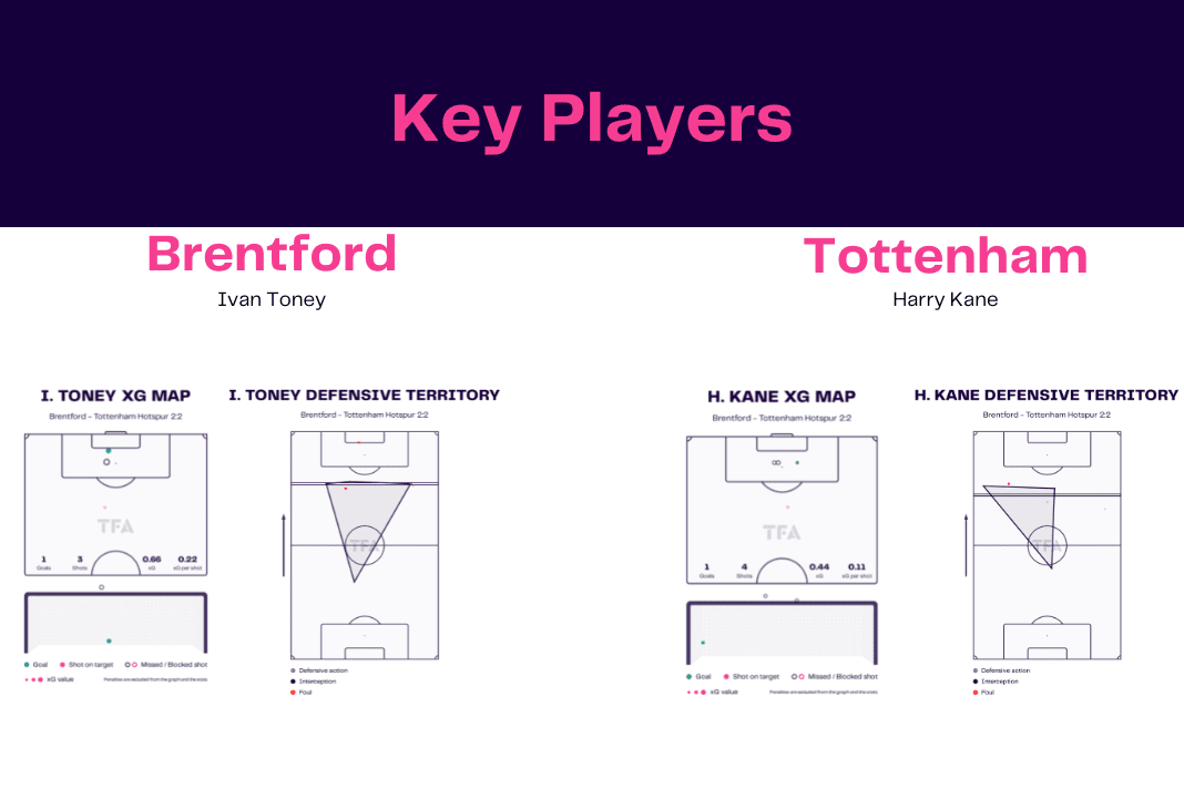
As can be seen from the image above, Toney had better chances in front of the net than Spurs’ number ‘9’ while also registering one fewer shot, although this does also show how efficient Kane is with his finishing, scoring a goal from an accumulated xG of merely 0.44 with an average xG per shot of just 0.11.
Conclusion
And there we have it! Now, you can successfully read our stats packs which are provided every single day on the Total Football Analysis website, so you have a clear understanding of every visualisation used and know what to look out for when browsing through the data.
The idea of these articles are to offer our wonderful readers the perfect place to look in-depth at each game from a statistical point of view to understand how the result happened and to offer insight into how events unfolded which may not be necessarily evident from the eye test.
The importance of statistical analysis is growing year after year, and we are just trying to do our part for all of our analytics lovers by offering a side of the game that isn’t available in many places, across all your favourite leagues around the world.
TFA looks forward to bringing you more and more stats packs from as many games as possible as the rest of the season progresses so make sure to stay tuned and check back on our website every single day for all our latest data bundles.



Comments